
ecommerce conversion
customer experience strategy
digital customer experiences
A sales performance metrics dashboard is a central hub that pulls all your key sales data into one place, displaying it with easy-to-read charts and graphs. It’s designed to cut through the noise of complex spreadsheets and give you actionable insights you can use to drive revenue and protect profit margins.
This gives sales leaders a real-time command center to monitor team performance, track progress against goals, and make smart, data-driven strategic decisions.
Most sales teams are drowning in data but starving for insight. When you're juggling disconnected spreadsheets and buried in endless reports, it’s impossible to get a clear picture of what's happening. This forces you to react to old news instead of getting ahead of the curve and proactively managing your business.
This is where a solid sales performance metrics dashboard completely changes the game. It’s the difference between guessing and knowing.
Think of it like a pilot's cockpit. A pilot isn't sorting through raw engine data mid-flight; they have a dashboard that shows altitude, speed, and direction at a glance. Your dashboard should do the same for your sales team, turning raw numbers into intelligence that helps everyone make faster, smarter decisions that directly impact the bottom line.
The purpose of a dashboard isn’t just to display data—it’s to compel action. It should answer your most pressing questions instantly: Are we on track to hit our quarterly target? Which reps are top performers, and who needs coaching? Where are the biggest bottlenecks in our sales funnel?
By focusing on the right metrics, you create a powerful feedback loop. For example, recent analysis shows that organizations that simplified their metrics saw a 30% jump in decision-making efficiency. This lets leaders pivot their strategy in a heartbeat and put resources where they’ll have the most impact on revenue generation. You can learn more about mastering sales performance dashboards and how they sharpen decision-making.
A great sales dashboard doesn't just show you what happened yesterday; it helps you win tomorrow. It’s a strategic asset that aligns the entire team around the metrics that matter most for revenue growth.
Ultimately, this tool becomes your single source of truth. It eliminates confusion and builds a culture of accountability and high performance. When everyone from the CRO to the newest SDR is looking at the same numbers, the conversation shifts from arguing about data to strategizing on how to exceed those numbers. That kind of alignment is the foundation for predictable, scalable growth.
An effective sales dashboard is not a data dump. We've all seen them—endless charts and numbers that look impressive but don't actually tell you what to do. This leads to a classic case of “analysis paralysis,” where you're so buried in information that you can't find a clear path forward.
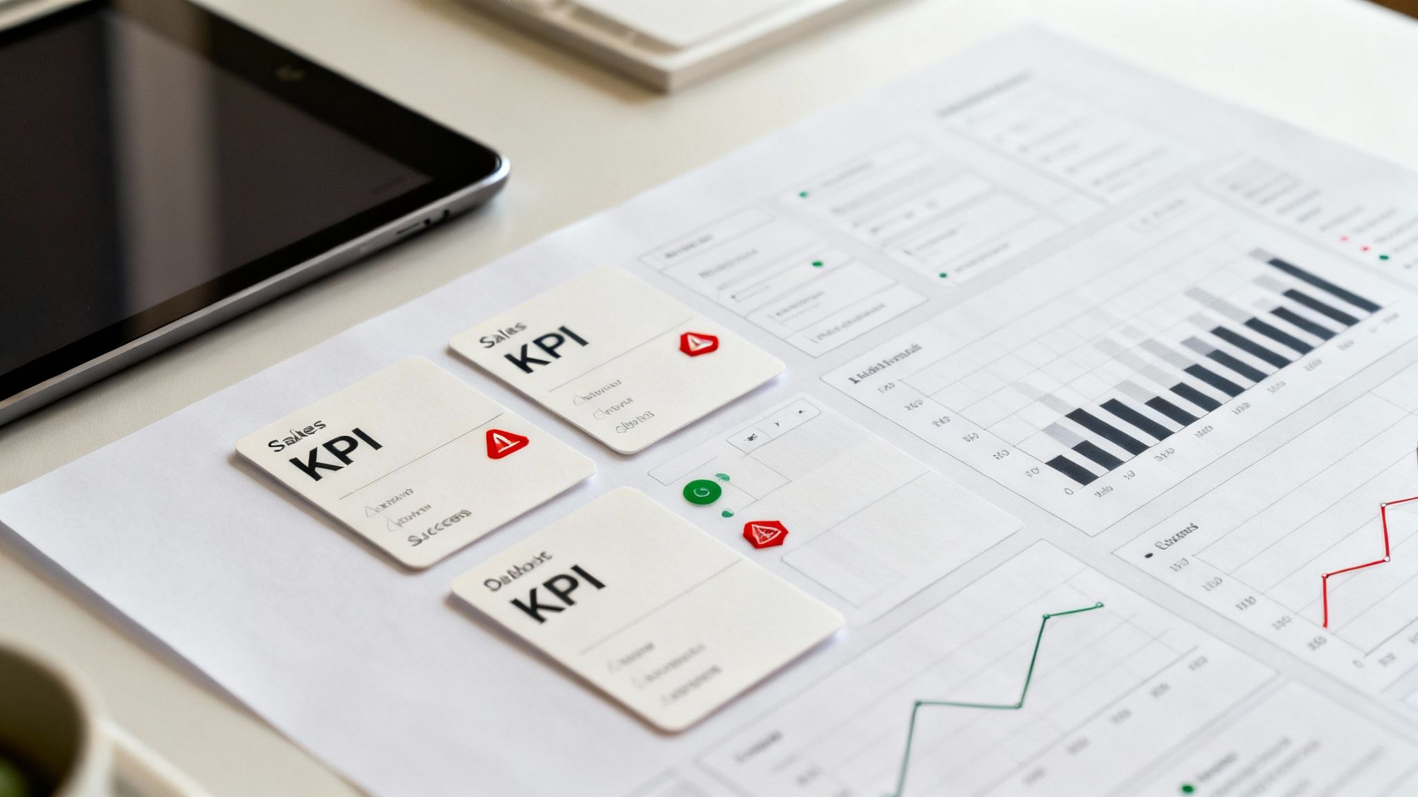
The secret to a powerful dashboard is curation. It’s about zeroing in on a handful of Key Performance Indicators (KPIs) that give you a complete, 360-degree view of your sales engine. Think of it less like a spreadsheet and more like the cockpit of an airplane, with gauges for every critical system.
To achieve this complete view, group your metrics into three core pillars: Revenue Health, Pipeline Integrity, and Conversion Efficiency. Organizing your dashboard this way transforms it from a simple reporting tool into a diagnostic powerhouse, helping you see not just what’s happening, but why.
This infographic highlights the evolution from basic data tracking to using dynamic dashboards as the engine for strategic growth.
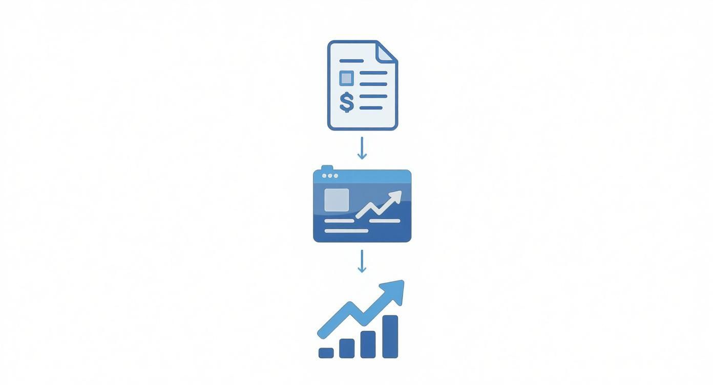
It’s this leap—from just collecting data to making strategic decisions—that separates the businesses that stagnate from the ones that scale.
To help you get started, here is a framework that breaks down the most essential metrics. This isn't just a list; it’s a way to connect the numbers on your screen to the strategic questions you need to answer every day.
| Metric Category | Key Performance Indicator (KPI) | What It Measures | Strategic Question It Answers |
|---|---|---|---|
| Revenue Health | Total Revenue | The top-line income from all sales activities. | Are we hitting our overall financial targets? |
| Revenue by Product/Service | Which specific offerings are generating the most income. | Where should we focus our sales and marketing efforts for maximum profit? | |
| Pipeline Integrity | Pipeline Value | The total potential value of all active deals. | Are we on track to meet future revenue goals? |
| Sales Cycle Length | The average time from first contact to a closed deal. | Where are our deals slowing down, increasing acquisition costs? | |
| Conversion Efficiency | Win Rate | The percentage of opportunities that result in a sale. | How effective is our sales process and team? |
| Lead Conversion Rate | The percentage of new leads that become qualified opportunities. | Is marketing delivering high-quality leads that convert to revenue? |
Think of this table as your starting point. These six KPIs offer a robust, high-level view of your entire sales operation, preventing you from getting lost in the weeds while still giving you the insights needed to make smart, revenue-driving decisions.
Let's dive a little deeper into each category.
This is where performance is ultimately measured. Revenue metrics are the ultimate lagging indicators—they tell you the final score of your past efforts. While they look backward, they are absolutely critical for judging the overall health of the business and setting the bar for future performance.
Total Revenue: This is the top-line number everyone from the CEO to the newest sales rep has their eyes on. It's typically tracked against monthly, quarterly, and annual goals. If this number dips, it’s the clearest signal you can get that something, somewhere in the process, requires immediate attention.
Revenue by Product/Service: This is where you find the story behind the total revenue number. It tells you what’s actually selling. Is a new product line driving growth? Is a high-margin service being overlooked by the sales team? This insight is crucial for everything from inventory management to marketing campaigns and sales training.
If revenue metrics are your rearview mirror, your pipeline is the windshield. The health of your sales pipeline is the single best predictor of your future success. A weak, bloated, or slow-moving pipeline today is a guarantee of a revenue miss down the road.
A healthy sales pipeline isn't just about size; it's about velocity and value. Monitoring its integrity allows you to spot future revenue gaps months in advance, giving you precious time to correct course before it impacts the bottom line.
Pipeline Value: This gives you the total potential dollar amount of every deal you're currently working. It’s a powerful high-level forecast, but its real value comes from segmentation. If you see a massive value stuck in an early "discovery" stage, for example, it may indicate a problem with how your team is qualifying new leads.
Sales Cycle Length: This is the average time it takes for a deal to go from initial contact to a signed contract. A lengthening sales cycle is a major red flag. It drives up your customer acquisition costs and pushes revenue further out. Pinpointing exactly where deals are stalling is the first step to unclogging your entire revenue stream.
Conversion metrics show you how effective your team is at moving deals from one stage to the next. High efficiency means you're getting the most out of every lead you generate, which goes straight to your profitability. Top-performing sales teams are obsessed with these numbers because they know that small improvements here can lead to massive revenue gains. If you're in B2B, you can learn more about the top metrics for B2B success to see how these KPIs are put into practice.
Win Rate: Simple and powerful. Also called the close rate, this is the percentage of your opportunities that you actually win. If your win rate starts to drop, it’s time to investigate. Is it a coaching issue? Is your product positioning off? Or is a new competitor winning market share?
Lead Conversion Rate: This one is crucial for sales and marketing alignment. It measures the percentage of raw leads that get qualified and turn into legitimate sales opportunities. A low rate here means sales is wasting precious time on low-quality leads. Improving this is the key to filling your pipeline with high-potential deals right from the start.
A great sales dashboard has more to do with psychology than technology. The best ones are designed for the human brain, turning a sea of complex data into a clear story you can understand in seconds.
The ultimate goal is "glanceability"—the ability for a sales leader to look at a screen and instantly know what’s going on. This isn't about cramming every metric you can think of onto one page. It’s about smart, strategic design that pulls your eyes to what truly matters.
Think of your dashboard like the front page of a newspaper. The biggest headline grabs your attention first. That’s visual hierarchy. Not all data is equally important, and your dashboard shouldn’t pretend it is.
Your most critical numbers—like your progress toward the quarterly revenue goal—should be the biggest and boldest things on the screen. Place them at the top left, where our eyes naturally start reading. From there, you can move to key summaries and then the finer details, allowing anyone to get the main idea immediately and dig deeper if they need to.
An uncluttered layout is non-negotiable. Behavioral economics research shows that when faced with too much information, our brains tend to shut down. This is called 'decision paralysis,' and it’s the enemy of action. A clean dashboard with plenty of white space avoids this, encouraging clear thinking instead of confusion.
Color isn’t just for decoration; it’s a shortcut for your brain. The right color can tell you if things are good or bad before you even read a single number. The same goes for charts—a simple graph can reveal a trend that a spreadsheet would completely hide.
Actionable Takeaway: Implement a simple color-coding system. Use green for metrics that are on or above target, red for those that are significantly below, and yellow/amber for metrics that need attention. This immediately focuses the user on problem areas.
Best Practices for Visualization:
When you nail the visuals, you make the data effortless to interpret. That’s how you build a tool that your team will actually want to use every day.
A one-size-fits-all dashboard is a recipe for failure. The information a CRO cares about is worlds apart from what a frontline sales rep needs to plan their afternoon. The key is to create different views for different roles.
This role-based approach guarantees that everyone sees the most relevant information for their job, turning the dashboard from a reporting tool into an essential part of their daily workflow. It directly connects their day-to-day actions to the company’s biggest goals, which is a massive motivator. It’s a bit like learning how to measure marketing campaign effectiveness; you’re connecting specific inputs to the outcomes they produce.
A sales performance dashboard isn't just a fancy report card showing what happened last quarter. When built right, it’s a tool that actively shapes your company's future. Its true power is only unlocked when every single chart and number is directly tied to your most critical business goals, like revenue growth, market share expansion, or profit margin protection.
Without that connection, you’re just tracking data for the sake of it.
Think about it this way: if your big-picture goal is to grab more market share, your dashboard shouldn't just show a giant "total revenue" number. It needs to zero in on metrics like your New Customer Acquisition Rate and Sales Volume in Target Territories. This simple alignment instantly transforms the dashboard from a passive reporting tool into a strategic compass that points everyone in the same direction.
This process ensures that daily activities always serve the bigger mission. It gives the team clarity and purpose, answering that all-important question for every single rep: "How does what I'm doing today actually move the company forward?"
One of the most powerful ways to get your whole team aligned is by setting cascading goals. This is a framework where you take high-level company objectives and break them down into smaller, bite-sized targets for departments, then teams, and finally, individual reps. Your dashboard is the perfect canvas to visualize this entire chain.
Let's say the company sets a goal to increase annual recurring revenue (ARR) by $5 million. Here’s how that goal cascades down:
When you build this logic directly into your sales dashboard, every person can see exactly how their individual effort rolls up to the company’s ultimate success. It creates a profound sense of ownership and keeps everyone accountable.
To make your dashboard a truly forward-looking tool, you have to shift your focus. Stop staring only at lagging indicators and start prioritizing leading indicators.
What's the difference?
A dashboard that over-indexes on lagging indicators is a historical record. A dashboard built around leading indicators is a strategic weapon.
It allows managers to see trouble coming and coach their teams to success before a quarter completely derails.
Actionable Takeaway: For your next team meeting, have each rep identify one leading indicator they can personally influence (e.g., number of outreach calls) and set a weekly goal for it. Track this on the dashboard. This shifts focus from outcomes to the controllable actions that produce them. If a rep's "Demos Booked" metric is trending down, a manager can jump in immediately to help with prospecting. If you wait for the "Quarterly Revenue" number to dip, it’s already too late. This proactive approach is key, and understanding how data analytics can impact your B2C marketing goals gives a great parallel view on using predictive data to get ahead.
By visualizing these leading metrics, you essentially transform your dashboard from a rearview mirror into a GPS, guiding your team exactly where they need to go.
For e-commerce brands, especially those running on Shopify, the sales cycle isn't a matter of weeks or months. It's happening in minutes and seconds. This breakneck pace calls for a completely different kind of sales performance dashboard—one built for instant action and real-time tweaks to maximize revenue and protect margins.
Forget about traditional B2B metrics like sales cycle length. In e-commerce, your dashboard needs to laser-focus on the KPIs that give you a direct window into customer behavior and, ultimately, your store's profitability. This is how your data becomes a tool for immediate course correction, not just a historical record.
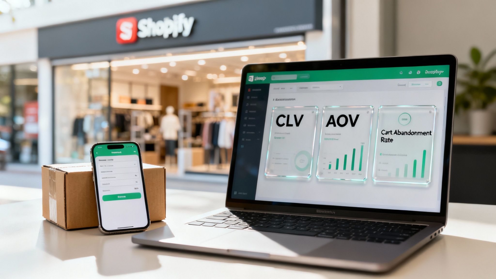
In the fast-moving world of online retail, a handful of metrics tell you almost everything you need to know about the health of your business. If you build your dashboard around these, you'll always have your eye on what truly moves the needle. To build effective strategies for Shopify and other e-commerce brands, you have to define and track key ecommerce performance metrics to fuel sustainable growth.
These three metrics are the bedrock of a strong e-commerce dashboard. They shift your focus from just making one sale to building a profitable, long-lasting business.
An actionable dashboard can't operate in a vacuum. For a Shopify store, its real power is unleashed when it pulls in data from your entire marketing and sales ecosystem. This paints a complete picture of the customer journey, from the first ad they clicked to their most recent purchase and beyond.
Imagine a dashboard that not only syncs with your Shopify admin but also plugs directly into your marketing automation tools.
By linking Shopify sales data with platforms like Klaviyo for email or Attentive for SMS, you can see exactly which marketing campaigns are driving the most valuable customers. This closes the loop between marketing spend and actual revenue, enabling smarter budget allocation.
This kind of integration lets you answer game-changing questions in real-time. Which email flow is best at converting high-AOV customers? Which SMS campaign is your secret weapon for recovering abandoned carts? Without a connected dashboard, you're just guessing. With one, you're making data-driven moves. As you scale, you might even look into a more comprehensive ecommerce marketing platform to unify these data streams even further.
To see how this all comes together, here’s a sample layout designed for an e-commerce manager whose job is to turn data into profit:
| Dashboard Section | Primary Metric | Supporting Metrics | Strategic Question it Answers |
|---|---|---|---|
| Revenue Performance | Total Sales (Today/Week/Month) | AOV, Conversion Rate | Are we on track to hit our sales targets? |
| Customer Acquisition | New vs. Returning Customer Revenue | Customer Acquisition Cost (CAC) | Are our acquisition efforts attracting profitable new customers? |
| Conversion Funnel | Cart Abandonment Rate | Checkout Abandonment Rate, Add to Cart Rate | Where are we losing potential customers in the buying process? |
| Marketing Effectiveness | Revenue by Marketing Channel (Email, SMS, Ads) | ROAS (Return on Ad Spend) | Which marketing channels are delivering the highest ROI? |
This kind of structure gives you a clean, top-down view of the business. The manager can see top-line performance at a glance, quickly diagnose any friction in the customer journey, and pinpoint the most valuable segments to target for future growth. It transforms the dashboard from a simple report into a true command center for driving revenue.
Diving into the world of sales dashboards can feel a little overwhelming at first. To help clear things up, here are answers to the most common questions that pop up when teams start building out their own command centers.
Without a doubt, the single biggest mistake is "metric hoarding." It's the temptation to cram every single piece of data you can find onto one screen. This is a classic error that creates a mess of visual clutter and leads straight to decision paralysis—which completely defeats the purpose of having a dashboard in the first place.
Instead of tracking every metric under the sun, be selective. Focus on a curated set of 5-7 core KPIs that tie directly to your most critical business goals. A great sales dashboard should provide instant clarity, not a headache.
Before you add any metric, ask yourself this simple question: "What decision will this number help us make?" If you don't have a clear and immediate answer, it doesn't belong on your main dashboard.
This disciplined approach is what keeps your dashboard a sharp, actionable tool that empowers your team instead of overwhelming them.
There’s no magic number here—the right update frequency really depends on your sales cycle and what you're tracking. But the golden rule is this: the data has to be fresh enough for you to actually do something about it.
Here’s a simple way to think about it:
The best move you can make is to automate your data feeds. It takes the guesswork out of it, ensures everything is timely and accurate, and frees up your team from the soul-crushing task of manual data entry. That way, managers can focus on making smart course corrections before a small issue becomes a big problem.
Generally, no. While transparency is valuable, role-specific dashboards are almost always more effective. When you tailor the view to someone's specific job, the information becomes far more relevant, actionable, and a lot less distracting.
A sales manager, for instance, needs a 30,000-foot view. They’re looking at overall team performance, the health of the entire pipeline, and how everyone is tracking toward quarterly goals. Their dashboard is strategic—it’s built for forecasting and coaching.
A sales rep, on the other hand, needs a ground-level view focused entirely on their own world. Their dashboard should highlight their personal pipeline, their activity metrics (like calls and emails), their conversion rates, and how close they are to hitting their quota. It helps them answer the most important question they have: "What do I need to do today to hit my target?"
Absolutely. You can get a solid start with tools you probably already use, like Google Sheets or Microsoft Excel. With some pivot tables, charts, and formulas, you can create a powerful basic dashboard to centralize your key metrics. They're a fantastic way to dip your toes in the water.
The biggest headache with spreadsheets, though, is the manual work. You're constantly plugging in new numbers and updating everything by hand, which not only eats up a ton of time but is also a recipe for human error. One wrong number can lead to some seriously misguided decisions.
As your team grows and your data gets more complex, you'll eventually hit a wall. That's when investing in a dedicated Business Intelligence (BI) tool or a CRM with strong dashboarding features really starts to make sense.
| Tool Type | The Good | The Bad |
|---|---|---|
| Spreadsheets (Excel, Google Sheets) | Low cost, everyone knows how to use them, flexible. | Manual data entry, easy to make mistakes, not real-time. |
| BI Tools (Tableau, Power BI) | Amazing visuals, automates data integration, super customizable. | Steeper learning curve, can get pricey. |
| CRM Dashboards (Salesforce, HubSpot) | Pulls sales data automatically, real-time, built for sales teams. | Might not be as customizable as a dedicated BI tool. |
So while spreadsheets are a great place to start, platforms that automate your data give you a much better long-term return. They deliver accurate, real-time insights that save time and fuel smarter, faster decisions.
Ready to turn casual shoppers into loyal customers? Quikly uses the science of urgency, grounding powerful psychological principles like scarcity and anticipation in your marketing to create high-impact "Moments" that drive immediate action and boost revenue. Our platform moves beyond basic timers to implement sophisticated, automated behavioral triggers that enhance the entire shopper journey.
Discover how Quikly can transform your e-commerce sales today.

