
ecommerce conversion
customer experience strategy
digital customer experiences
An effective landing page for ecommerce isn't just another page on your website. Think of it as a purpose-built sales machine. It's a standalone page, created specifically for a single marketing campaign, with one mission and one mission only: turning visitors into customers.
This isn't your homepage, cluttered with navigation and competing messages. It's a focused, distraction-free environment engineered to drive a specific action, whether that’s snapping up a new product or signing up for an exclusive drop.
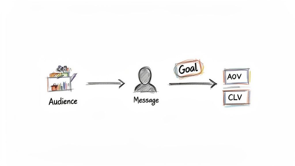
Before you even think about colors, fonts, or layouts, you need to build a rock-solid strategic foundation. A high-impact landing page starts with a crystal-clear, measurable business goal that goes way beyond just "making sales." Every single decision that follows—from the headline down to the button color—has to serve this core purpose.
This means tying your page directly to real business metrics. For instance, maybe your goal is to liquidate excess inventory before it starts eating into your profit margins. Or perhaps you're launching a limited-edition product to spike your Average Order Value (AOV) among your most devoted followers.
Your landing page needs one job. Period.
Trying to do too much at once—sell a product, grow your email list, and get more social media followers—is a recipe for disaster. It just creates confusion and tanks your conversion rates. Consumer psychology research calls this "choice paralysis"; give people too many options, and they'll often choose none of them.
Instead, zero in on a single, revenue-centric goal. Here are a few examples:
A landing page without a single, defined objective is like a ship without a rudder. It might look good, but it's not going anywhere specific and certainly won't reach its intended financial destination.
Once your goal is locked in, it's time to get inside your audience's head. You have to connect that goal to their deepest motivations and pain points. What makes them tick? What psychological triggers will get them to take action?
Are they driven by a fear of missing out (FOMO)? A desire for social status? Or the thrill of a unique experience?
Figuring this out is how you craft a core message that hits on an emotional level. For example, a landing page for a limited-stock sneaker drop plays on scarcity and exclusivity, principles well-documented in behavioral economics. On the other hand, a page for a new wellness supplement needs to address health concerns and build a foundation of trust.
This guide on how to create landing pages that actually convert offers a great holistic view of this process. Getting your strategic messaging right from the start will guide every single design and copy decision you make down the line.
A landing page that actually converts isn't just a random collection of pretty elements. It’s a carefully engineered experience. Successful brands understand that every component has a distinct psychological job to do—guiding a visitor from mild curiosity to confident action.
Let's break down the essential pieces that transform a standard page into a sales machine.
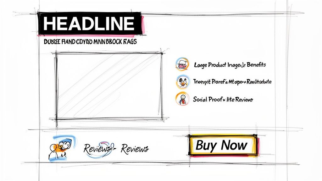
Your headline is your first—and sometimes only—shot. You have about three seconds to convince someone they’ve landed in the right place. It has to immediately answer the visitor's unspoken question: "What's in it for me?"
A powerful headline doesn't just describe your product; it promises an outcome. The subheadline then swoops in to back it up, offering a quick, digestible explanation of how you make that promise a reality.
In the world of ecommerce, your customers can't touch, feel, or try on your product. This creates a natural barrier of hesitation. High-quality visuals—both images and videos—are your best tools for tearing down that wall.
Good visuals do more than just show off your product; they build trust and dial down the perceived risk. Show it from every angle. Show it in use. Show it in a real-world context that your customer can imagine themselves in. A short video demo can be a game-changer, making the abstract feel tangible and answering questions before they even form.
This is a big one. Your copy needs to scream benefits, not just whisper features. A feature is what your product is (like "100% cashmere"). A benefit is what the customer gets (like "unmatched softness and warmth all winter"). This simple shift in perspective is what connects your product directly to a customer's real-world needs and desires.
This is also where social proof comes in to seal the deal. We're all wired to look at what others are doing to guide our own choices—it’s a powerful psychological shortcut.
Customer reviews, star ratings, and user-generated content (UGC) aren't just nice-to-haves. They're powerful validation signals that tell a visitor, "Yes, you're making a smart choice."
Sprinkle these elements near your call-to-action to give shoppers that final nudge of confidence right when they need it most. If you're on Shopify, there are great apps that pull authentic reviews directly onto your landing pages. For a deeper dive into structuring these elements, these 10 Best Practices for Landing Page Design are a great resource.
At the end of the day, every single element on your page should funnel visitors toward one, unmissable Call-to-Action. This is the final step, and there's no room for error.
This isn't just about making things look good. It's about using visual hierarchy and persuasive language to create a completely frictionless path to purchase.
Every landing page is a conversation with your customer. The table below breaks down the key components, the psychological role they play in that conversation, and a practical tip to get it right.
| Component | Psychological Goal | Actionable Tip |
|---|---|---|
| Headline | Grab Attention & Establish Relevance | Promise an outcome, don't just state a feature. Make it about the customer's transformation. |
| Hero Image/Video | Build Desire & Overcome Uncertainty | Use high-resolution, context-rich visuals. Show the product in use by someone who looks like your ideal customer. |
| Benefit-Oriented Copy | Create an Emotional Connection | Translate every feature into a tangible benefit. Answer "So what?" for the customer. |
| Social Proof | Build Trust & Reduce Risk | Place star ratings and a key customer quote directly below the product title or near the CTA button. |
| Call-to-Action (CTA) | Drive a Single, Focused Action | Use a contrasting button color and action-oriented text. Remove all other distracting links or navigation. |
| Urgency/Scarcity Cues | Compel Immediate Decision-Making | Add a countdown timer for a sale or show low stock levels ("Only 3 left!") to prevent procrastination. |
By thoughtfully constructing each of these elements, you're not just designing a page; you're engineering a persuasive experience that guides visitors smoothly from interest to conversion.
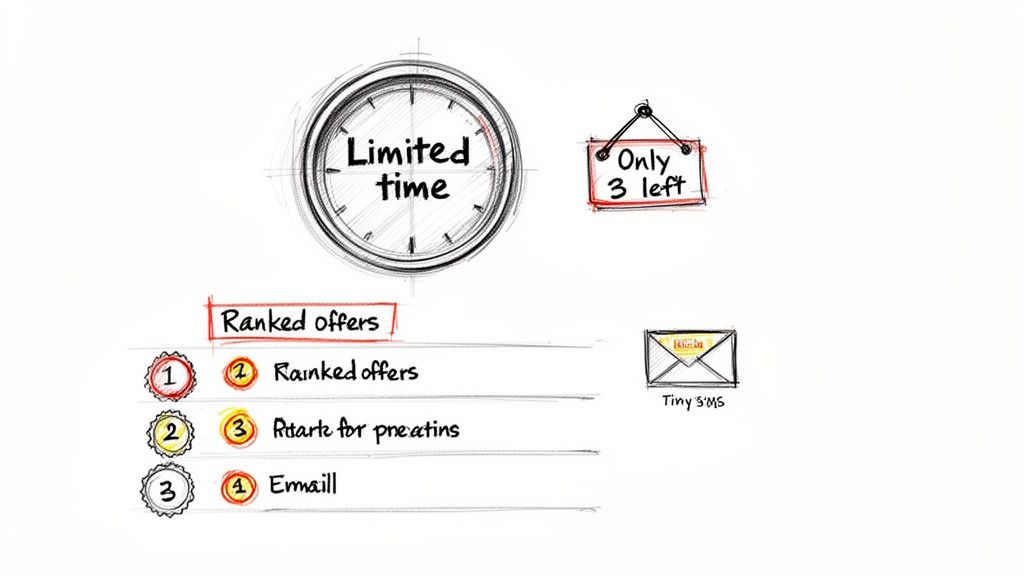
A landing page without a sense of urgency is a passive storefront, merely hoping someone makes a decision. A high-performing landing page for ecommerce, on the other hand, is an active participant in the buying journey, built to overcome the human tendency to procrastinate.
This isn't about slapping a generic countdown timer on the page. True urgency marketing is a science, deeply rooted in consumer psychology. It leverages powerful principles like scarcity (we desire what is limited) and FOMO (the Fear Of Missing Out), which are far more persuasive than a simple ticking clock.
Most basic pop-up and banner apps focus on email capture or showing a simple discount timer. While they can be useful, they rarely drive immediate revenue. A far more powerful approach is to create dynamic, event-based urgency that is directly tied to your inventory levels and business goals. This is the difference between simple tactics and sophisticated psychology.
Consider more advanced strategies grounded in behavioral economics:
Urgency isn’t about manipulation; it’s about motivation. By framing an offer around a clear and finite opportunity, you help customers overcome decision paralysis, the single biggest killer of conversions. This is especially critical when an industry benchmark like a 70% cart abandonment rate shows how frequently shoppers hesitate.
This approach transforms your landing page from a static catalog into a dynamic, can't-miss event, shifting the customer’s mindset from "I'll think about it" to "I need to get this now."
The most effective urgency campaigns don't just live on your landing page. They're woven into your entire marketing ecosystem, creating a cohesive narrative that builds momentum.
This is where sophisticated automation, like that offered by Quikly, excels. By integrating with the marketing tools you already use—like Klaviyo for email or your favorite SMS platform—you can build a seamless, high-urgency journey. Imagine building anticipation for a product drop with a series of emails, sending a "Go Live" text the moment the landing page is active, and then following up with reminders that reinforce scarcity.
That level of automation is worlds away from the manual campaign management required by basic apps. It empowers Shopify Plus merchants to run complex, multi-channel campaigns that not only boost immediate revenue but also help manage inventory by creating predictable sales spikes. By applying these 10 urgency marketing tactics, you can move beyond simple conversion lifts and start directly impacting your ROI and protecting profit margins.
A beautiful landing page that loads at a snail's pace or stays invisible to search engines is a wasted investment. The technical health of your landing page for ecommerce isn't a background detail; it's a primary driver of revenue.
Every single element, from the size of your hero image to your meta descriptions, directly impacts whether a user sticks around, trusts your brand, and ultimately, clicks "buy."
Slow-loading pages are conversion killers. It's not just an inconvenience; it triggers a psychological impatience that sends potential customers bouncing before they even see your offer. The numbers are unforgiving.
Data shows that pages loading in a respectable 2.4 seconds see a 1.9% conversion rate. But if that load time creeps up to just 5.7 seconds? The rate plummets to a dismal 0.6%. You can dig into more of the data on these critical benchmarks and see for yourself how speed impacts ecommerce conversions.
For those of you on Shopify, the good news is you don't need to be a developer to make a huge difference. It often starts with something simple: your images.
Heavy, unoptimized images are the number one culprit behind slow pages. Before you upload any product photos or banners, make it a habit to run them through an image compression tool first. Shopify also has apps like Crush.pics that can automate this, keeping your visuals sharp without the bloat. This one step can shave precious seconds off your load time.
Actionable Takeaway: Audit your landing page's app usage. While apps add features, each one injects code that can slow things down. Be ruthless. If an app isn't directly contributing to the single, focused goal of this specific landing page, consider disabling it just for that page.
While speed keeps visitors on your page, SEO is what gets them there in the first place. Your landing page needs to speak Google's language to attract that high-intent organic traffic you're looking for.
Start by making sure your main keyword—something like "women's vegan leather tote"—is in these key spots:
/products/vegan-leather-tote.A well-optimized page speaks to both humans and search engine crawlers. SEO isn't about stuffing keywords everywhere; it's about creating a clear, relevant, and authoritative page that Google feels confident recommending to people.
Finally, a flawless mobile-first design is absolutely non-negotiable. With over 60% of ecommerce traffic now coming from mobile devices, your landing page must look and work perfectly on a small screen.
Shopify themes are responsive by default, which is a great start, but always, always preview your page on a real mobile device. Make sure the buttons are easy to tap and the text is readable without pinching and zooming. This is a core part of both user experience and modern SEO. For a deeper dive into creating effective user experiences, check out our guide covering the best practices for web design.
Hitting "publish" on your landing page isn't the finish line. It's the starting gun.
The real, sustainable revenue growth comes from a disciplined commitment to testing, learning, and iterating based on how real people actually behave on your site. A static page is a missed opportunity. A page that evolves with data becomes a reliable business asset that generates predictable revenue.
The process starts when you shift your mindset from a one-and-done launch to a continuous loop of improvement. The idea is simple: make small, controlled changes, measure their impact, and keep what works. This is exactly how you systematically turn a good landing page for ecommerce into a great one.
It’s a simple but powerful cycle: you track user behavior, test variations based on what you see, and implement the winning changes to improve performance.
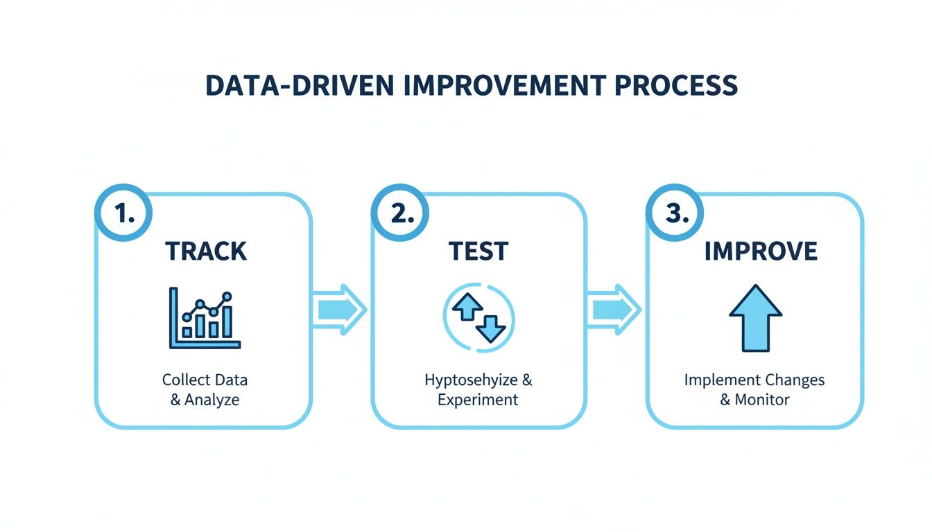
Following this loop ensures every decision you make is backed by evidence, not guesswork. And that's what leads to consistent, predictable gains over time.
Effective A/B testing—sometimes called split testing—is all about isolating one variable at a time to see what truly resonates with your audience. Don't try to overhaul the entire page at once. Instead, focus your energy on the high-impact elements first.
Start with your most critical components:
The goal here is to gather clear, actionable data. You can run these tests through various Shopify apps or Google Optimize to see which version drives more clicks, adds-to-cart, and ultimately, sales.
Your conversion rate is the north star, but it doesn't tell the whole story. To truly understand what’s happening, you need to track a broader set of Key Performance Indicators (KPIs) in your Shopify Analytics and Google Analytics dashboards.
Globally, e-commerce landing pages have a median conversion rate of just 2.5%. The top performers, however, hit 11.4% or higher, potentially quadrupling their revenue. Data is what closes that gap. Research shows that consistent A/B testing alone can boost conversions by up to 30%, proving that small, informed tweaks deliver massive lifts.
Beyond the final sale, keep a close eye on these metrics:
This data-driven approach is the foundation of successful web conversion optimization. By analyzing these numbers, you move beyond assumptions and start making informed decisions that systematically improve your page’s performance and drive measurable ROI.
For more strategies on this, explore our complete guide to web conversion optimization.
Even with a killer strategy, you're bound to run into some specific questions when you're in the trenches building a high-performing landing page for ecommerce. Getting these right can be the difference between a campaign that flops and one that flies.
Let's clear up a few of the most common challenges people grapple with.
There's no magic number here. The real answer is: it depends entirely on your marketing.
Best practice is to build a unique, dedicated landing page for every single campaign, ad group, or audience you're targeting. Think about it this way—you wouldn't run the same TV ad during a football game and a reality show, right? The same logic applies here.
You should have separate pages for things like:
This approach nails what we call message match. It ensures the headline and offer on your page are a perfect mirror of the ad or link that brought the visitor there. That consistency builds instant trust and can have a massive impact on your conversion rates. A sophisticated Shopify Plus merchant, for example, might be juggling dozens of these pages at once for their global campaigns.
Everyone wants to know the magic number, but "good" is incredibly relative. While the global median conversion rate for ecommerce landing pages floats around 2.5%, that number can be misleading.
Your industry, the price of your product, and where your traffic is coming from all dramatically change the equation. A better way to think about it is to benchmark against your own past performance. The goal should always be continuous, data-driven improvement.
Instead of getting hung up on an arbitrary number, focus on systematically moving your store's average up. The top performers in ecommerce often see rates of 11.4% or higher. They don't get there by accident; it’s the result of methodical A/B testing and smart urgency marketing that taps into real customer psychology.
Technically, yes, you can send campaign traffic straight to a product page. But should you? Rarely.
Your standard product pages are built for browsing. They're usually cluttered with navigation menus, "you might also like" sections, and all sorts of other links. Each one of those is an exit ramp, pulling visitors away from the one action you want them to take.
A dedicated landing page, on the other hand, has one job and one job only. It strips away all the distractions and creates a frictionless path to purchase, guiding the user toward a single, specific action. For any high-stakes campaign—especially one you're pouring ad money into—a purpose-built landing page will almost always blow a standard product page out of the water when it comes to generating revenue.
Ready to transform your landing pages from static displays into high-urgency conversion events? Quikly provides the tools to implement advanced, psychology-backed campaigns that drive immediate sales and protect your profit margins. Discover how our platform can elevate your marketing strategy.

