
ecommerce psychology
brand loyalty
best brand experiences
In the hyper-competitive world of e-commerce, a beautiful website is no longer enough. The difference between a store that struggles and one that thrives lies in a deeper understanding of consumer psychology and its direct impact on revenue. Generic advice falls short; sustainable growth is built on a strategic foundation. This is why mastering the best practices for web design is not just a creative exercise but a critical business imperative focused on maximizing return on investment.
This guide moves beyond surface-level tips and dives into 10 impactful, ROI-focused principles, grounding each one in behavioral science. We will explore how to transform your Shopify store from a simple digital catalog into a high-performance conversion engine. By strategically applying these techniques, you can significantly lift revenue, protect profit margins, and create a shopping journey that turns casual browsers into loyal customers. The goal is to ensure your design is effective and future-proof. To that end, you may also find it helpful to consider these 8 essential website design tips for 2026 as a supplementary resource for long-term planning.
Here, we'll cover everything from mobile-first layouts that cater to modern shoppers and persuasive CTAs that guide user action, to building unshakable trust with potent social proof. Forget basic countdown timers; we are entering the era of scientifically-backed, automated urgency marketing that elevates the entire customer experience by tapping into powerful psychological triggers like scarcity and the Fear of Missing Out (FOMO). Each practice outlined below is designed to be actionable, providing a clear roadmap to not only improve your site’s usability but also to directly boost your bottom line.
Mobile-first design isn't just a trend; it's a foundational strategy for modern e-commerce and a crucial element of the best practices for web design. This approach flips the traditional design process on its head. Instead of designing for a large desktop screen and then scaling down, you begin with the smallest screen-a mobile device-and progressively enhance the design for larger displays. This methodology forces you to prioritize essential content and functionality from the outset, ensuring a lean, fast, and highly effective user experience where it matters most.
Given that over 60% of e-commerce traffic originates from mobile devices, a mobile-first approach directly impacts your bottom line. It ensures that critical elements like product images, calls-to-action (CTAs), and especially time-sensitive urgency marketing campaigns, are perfectly rendered for on-the-go shoppers.
A responsive site that simply shrinks desktop content for mobile often creates a clunky, frustrating experience. In contrast, a mobile-first design is inherently conversion-focused. It leverages the psychology of immediacy that defines mobile shopping. This is especially vital for urgency tactics, which thrive on the impulse-driven nature of mobile interactions. Think of ASOS's mobile app, which uses prominent banners and clear timers for its flash sales, making it incredibly easy for users to act quickly. Similarly, Amazon's mobile site places "Limited time deal" tickers directly in the user's view, creating a seamless path to purchase.
To effectively implement a mobile-first strategy, especially for a Shopify store, concentrate on these key areas:
Visual hierarchy is a core principle of psychology-driven design and one of the most impactful best practices for web design. It involves the deliberate arrangement and styling of elements to guide the user's eye toward the most critical information in a specific order. In e-commerce, this isn't just about aesthetics; it's a strategic tool that directs customer focus to conversion-critical elements like product prices, compelling "Add to Cart" buttons, and high-impact urgency marketing messages. A well-executed hierarchy reduces cognitive load, making the path to purchase feel intuitive and effortless.
By controlling what users see first, you can significantly influence their decision-making process. This is particularly crucial for time-sensitive campaigns, where instant comprehension is necessary to trigger the fear of missing out (FOMO) and encourage immediate action. A clear visual path ensures that limited-time offers and low-stock alerts are not just seen, but felt.
Without a clear visual hierarchy, your most persuasive elements get lost in the noise. Customers might miss a flash sale announcement or overlook a low-stock indicator, leading directly to lost revenue. Effective hierarchy leverages principles of size, color, and placement to make your value proposition and call-to-action unmistakable. For instance, Amazon's product pages use a large, bold price and a brightly colored "Add to Cart" button, placing them high on the page to immediately capture attention. Similarly, successful flash sale campaigns use oversized, high-contrast countdown timers as the focal point, ensuring the urgency is the first thing a user processes.
To apply strategic visual hierarchy on your Shopify store and maximize the impact of urgency-based marketing, focus on these tactics:
In the world of e-commerce, speed isn't just a feature; it's a fundamental pillar of the best practices for web design. Page performance directly impacts user experience, SEO rankings, and most importantly, your revenue. Every millisecond of delay increases the probability of a potential customer abandoning their cart, a risk that is amplified when time-sensitive urgency marketing tactics are in play. A slow-loading countdown timer or a delayed "limited stock" banner can undermine the very psychological principles they are meant to leverage.
Google's emphasis on Core Web Vitals has made it clear that site speed is a critical ranking factor. For Shopify stores, this means that optimized performance ensures urgency campaigns display instantly, customers see your value proposition without frustrating lag, and the path to purchase remains frictionless, protecting your conversion rate and overall profitability.
A slow website creates friction and doubt, directly contradicting the seamless experience needed to drive impulse purchases. Fast page loads build trust and maintain momentum. When a shopper clicks on a flash sale notification, they expect instant access. A delay breaks that spell and gives them time to second-guess their decision. High-converting brands like Amazon have famously demonstrated that even a 100-millisecond delay can cost 1% in sales. This is why ensuring that performance-critical elements, such as urgency marketing widgets, are highly optimized is non-negotiable.
To guarantee your Shopify store is operating at peak speed, especially when using dynamic elements, focus on these technical best practices for web design:
A clear and compelling call-to-action (CTA) is the linchpin of conversion, acting as the final bridge between user interest and a desired business outcome. This is one of the most critical best practices for web design because CTAs explicitly guide users to take the next step, whether that's adding an item to their cart, signing up, or claiming a limited-time offer. A well-designed CTA cuts through ambiguity and leverages psychological principles to prompt immediate action.
For e-commerce, especially when using urgency marketing, the CTA is the trigger. A campaign built on scarcity or a time-sensitive drop is only effective if the user has an obvious, frictionless path to act. A powerful CTA transforms passive browsing into active purchasing, directly impacting revenue and campaign ROI.
An uninspired or hidden CTA leads directly to abandoned carts and lost sales. In contrast, a strategically designed CTA harnesses color psychology, action-oriented language, and prominent placement to create a sense of inevitability. Think of Netflix’s iconic "Start Your Free Trial" button, which uses a high-contrast color and low-friction copy to maximize sign-ups. Similarly, a flash sale with a bold red "Claim Offer Now" button creates a visceral sense of urgency that a generic "Submit" button lacks. This isn't just about aesthetics; it’s about scientifically guiding user behavior to boost conversion rates.
To design CTAs that convert, particularly within a Shopify ecosystem, focus on these details:
Color is more than just an aesthetic choice; it’s a powerful psychological tool and a core component of the best practices for web design. This approach involves using color theory to reinforce your brand identity while deliberately evoking specific emotional responses that guide user behavior. For e-commerce, certain colors are universally understood to communicate urgency, importance, and opportunity, making them invaluable for driving conversions.
Strategic color use directly influences how shoppers perceive your offers. High-energy colors like red and orange naturally create a sense of immediacy and scarcity, which is critical for time-sensitive marketing campaigns. By aligning these psychological triggers with your established brand palette, you can prompt immediate action without disrupting the user's brand experience, ultimately boosting engagement and sales.
Effective color strategy creates a subconscious path to purchase. When a shopper sees a bright red countdown timer or a vibrant orange "Limited Deal" badge, their brain processes it as a high-priority event that demands attention. This isn't manipulation; it's leveraging established psychological principles to highlight value. Amazon, for example, uses distinct orange and gold accents for its deals to make them stand out, while Target's iconic red branding is synonymous with the excitement of shopping and finding a great deal.
In the context of urgency marketing, Quikly's campaigns often use red for countdown timers by default, tapping into its inherent association with importance and time-sensitivity. This simple color choice can significantly increase the perceived value and immediacy of an offer, leading to higher click-through rates and a direct positive impact on revenue. You can learn more about how to leverage the psychology of color on Quikly's blog.
To effectively integrate color psychology into your Shopify store's design, focus on these actionable steps:
Intuitive navigation and solid information architecture (IA) are the unsung heroes of high-converting websites and a core component of the best practices for web design. This principle is about organizing your site’s content and features so that users can find what they need-products, information, or special offers-with minimal effort. A logical IA reduces cognitive load, preventing the frustration that leads to abandoned carts and high bounce rates.
For e-commerce, this means customers can effortlessly discover products and, crucially, time-sensitive urgency campaigns. When a user can easily find a limited-time drop or a special offer, their path to purchase is frictionless, directly boosting engagement and revenue. Poor navigation, on the other hand, hides your most compelling offers and creates a barrier to conversion.
A confusing site structure actively costs you money. If a shopper can't find your "Flash Sale" category or has to click through multiple menus to locate a product, they are likely to leave. Excellent navigation guides users intentionally, leveraging psychological principles by making the discovery of deals feel seamless and rewarding. Amazon’s search-centric navigation and Best Buy’s layered filtering system are prime examples; they allow millions of users to pinpoint exact products from vast inventories quickly. Similarly, a Shopify store can create a dedicated "Limited Drops" section in its main menu, driving high-intent traffic directly to urgency-driven campaigns.
To build a navigation structure that enhances conversions and effectively showcases urgency marketing, focus on these critical steps:
Trust signals are crucial design elements that build credibility and confidence in your brand, a cornerstone of the best practices for web design. This is reinforced by social proof, a psychological phenomenon where people assume the actions of others reflect correct behavior. By integrating customer reviews, ratings, and real-time activity, you assure shoppers they are making a wise purchasing decision. For urgency marketing to be effective, customers must first trust that your limited-time offers are genuine; social proof validates this urgency.
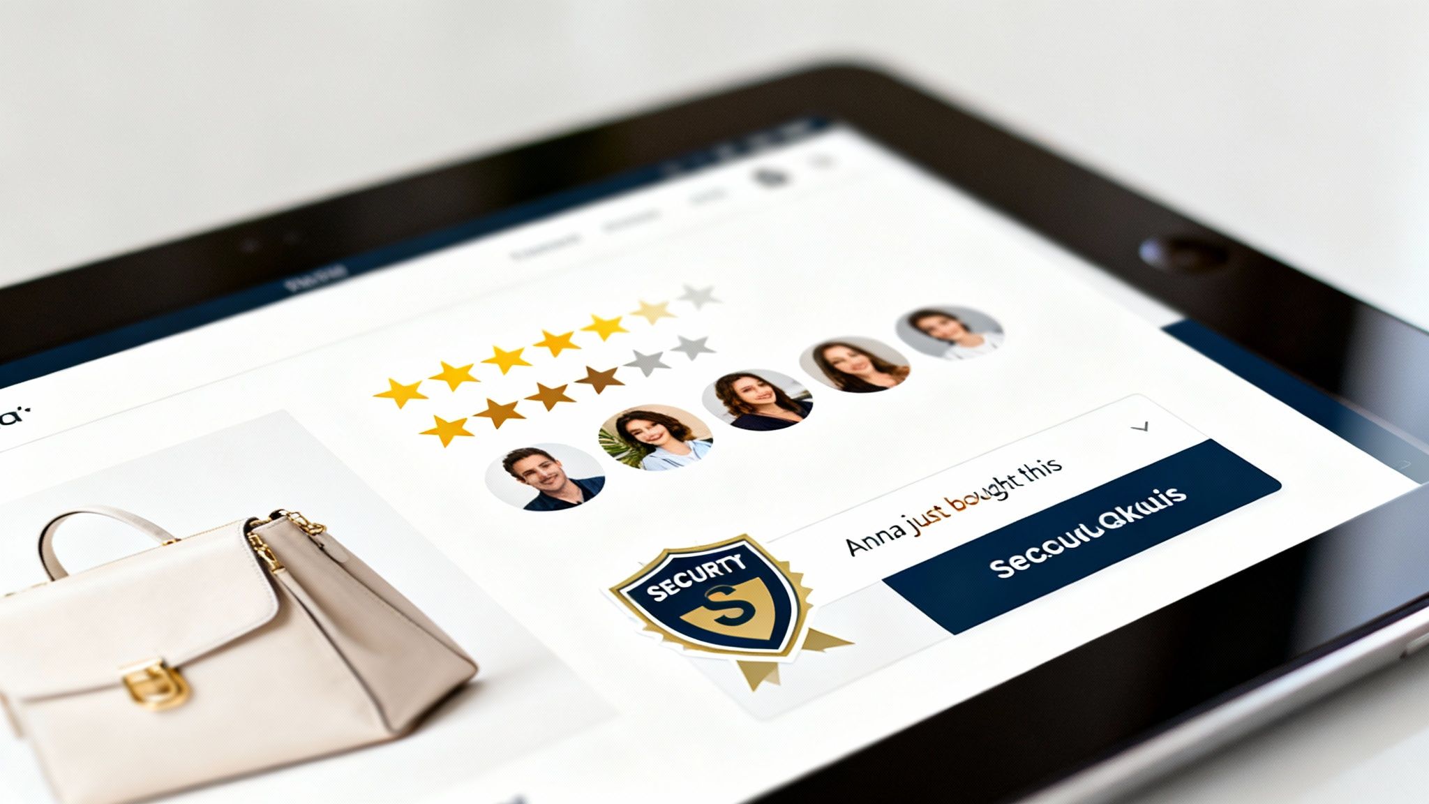
In a crowded e-commerce landscape, trust is a direct driver of revenue. A shopper hesitant about a purchase can be swayed by seeing that hundreds of others have bought and enjoyed the same item. This is where social proof turns browsers into buyers. It overcomes skepticism and reduces perceived risk, making customers more likely to act on impulse-driven urgency tactics. For instance, Quikly amplifies this effect by showing real-time notifications like "Sarah from New York just claimed this offer," which combines social proof with FOMO to accelerate conversions and directly impact sales. This is a powerful method you can learn more about by exploring this comprehensive guide to social proof.
To effectively integrate trust signals on your Shopify store and boost campaign effectiveness, focus on these strategies:
Web accessibility is a core component of the best practices for web design, ensuring that all users, including those with disabilities, can fully access and interact with your e-commerce site. This involves adhering to standards like the Web Content Accessibility Guidelines (WCAG), which provide a framework for creating a universally usable digital experience. Far from being a niche concern, accessibility expands your market reach, mitigates legal risks, and significantly improves overall site usability and SEO.
For e-commerce, this means every part of the shopping journey, from product discovery to checkout, must be accessible. This is especially true for dynamic, time-sensitive elements like urgency marketing campaigns. An inaccessible countdown timer or a "limited stock" banner fails to create FOMO for a segment of your audience, defeating its purpose and excluding potential revenue.
An inaccessible website is the digital equivalent of a shop with a blocked entrance; it turns away paying customers. By designing inclusively, you cater to the 1 in 4 adults in the U.S. who live with a disability, a demographic with significant spending power. Shopify's own focus on accessible themes underscores its commercial importance. Furthermore, accessible design principles often overlap with SEO best practices, such as semantic HTML and alt text, boosting your organic visibility.
When urgency is involved, accessibility ensures the psychological triggers work for everyone. A screen reader user must be able to perceive that an offer is ending soon, and a user with limited motor skills must be able to easily click the "Buy Now" button before time runs out. Brands that audit and improve their accessibility are not just complying with standards; they are optimizing their entire conversion funnel.
To integrate accessibility into your Shopify store, particularly for urgency-driven campaigns, focus on these critical actions:
Personalization is no longer a luxury; it’s a core component of effective e-commerce and one of the most impactful best practices for web design. This strategy involves tailoring the website experience to individual users based on their behavior, location, and purchase history. Dynamic content takes this a step further by adapting in real-time to display the most relevant products, offers, and messaging, transforming a static storefront into a one-to-one conversation.
This approach directly addresses the modern consumer's expectation for relevance. Instead of a one-size-fits-all approach, you present each visitor with a unique journey designed to resonate with their specific needs and interests. This dramatically increases engagement and reduces friction in the path to purchase.
A generic website experience is like a sales clerk who ignores the customer's questions. In contrast, a personalized site, like Amazon’s recommendation engine, acts as a helpful guide, anticipating needs and suggesting relevant items. This not only improves the user experience but significantly boosts Average Order Value (AOV) and lifetime value.
The real power emerges when personalization is combined with urgency. Instead of a generic flash sale, you can deliver hyper-relevant, limited-time offers based on customer segments. Imagine showing a special limited drop only to your VIP customers or presenting a unique "buy-it-again" urgency offer to a returning shopper. This creates a powerful sense of exclusivity and relevance that generic timers cannot match, compelling immediate action.
To integrate personalization and dynamic content effectively, particularly within a Shopify ecosystem, focus on these strategies:
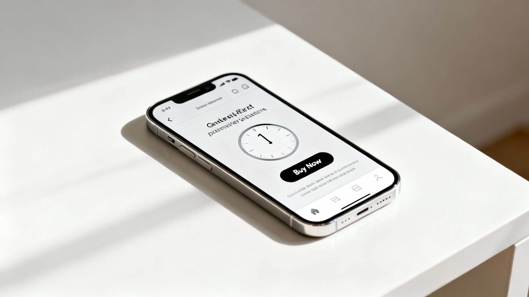
Urgency and scarcity are powerful psychological triggers that tap directly into the consumer's fear of missing out (FOMO). This principle is a cornerstone of effective e-commerce and one of the most impactful best practices for web design when executed authentically. By strategically introducing time-limited offers, real inventory countdowns, and limited-edition product drops, you can create a compelling reason for shoppers to act immediately rather than procrastinate. This isn't about manipulation; it's about framing value within a specific timeframe or quantity.
When implemented correctly, these elements transform passive browsing into active purchasing. The goal is to move the customer from "I'll think about it" to "I need to get this now." This technique is central to platforms like Quikly, which use sophisticated behavioral triggers to motivate customers to act, often boosting conversion rates significantly while enhancing the overall shopping experience.
Simply adding a generic countdown timer is not enough. Effective urgency is rooted in authenticity and perceived value. Amazon’s "Lightning Deals" combine a ticking clock with a visible stock level, creating a dual sense of urgency and scarcity. Similarly, Booking.com’s “Only 2 rooms left at this price” notifications leverage real-time data to create genuine scarcity, prompting immediate booking decisions. This approach doesn't just increase conversions; it protects profit margins by encouraging full-price purchases and helps manage inventory by accelerating the sale of specific items.
To integrate these psychological triggers effectively on your Shopify store, focus on genuine, data-driven tactics:
| Item | Implementation complexity | Resource requirements | Expected outcomes | Ideal use cases | Key advantages |
|---|---|---|---|---|---|
| Mobile-First Responsive Design | Medium–High (redesign + testing) | Front-end dev, responsive framework, device testing | Improved mobile conversions, lower bounce, better SEO | Mobile-dominant traffic, stores using urgency widgets | Consistent mobile UX; urgency elements display reliably |
| Strategic Use of Visual Hierarchy | Medium (design adjustments & testing) | UX/UI designer, A/B testing | Higher attention to CTAs, improved click-throughs | Product pages, flash sales, urgency-focused layouts | Directs user focus to offers and CTAs |
| Fast Page Load Times & Performance Optimization | High (ongoing technical work) | Devs/ops, CDN, performance tooling, monitoring | Reduced bounce, improved SEO (Core Web Vitals), faster widget loads | High-traffic stores, mobile users, time-sensitive campaigns | Faster load → better conversions and retention |
| Clear & Compelling CTA Design | Low–Medium (design + copy testing) | Designer, copywriter, A/B testing tools | Increased conversions, reduced friction | Checkout/product pages, urgency-driven offers | Clear action paths; improves conversion rate |
| Strategic Use of Color Psychology & Branding | Medium (design + testing for contrast) | Brand designer, accessibility testing, A/B tests | Stronger brand recognition, higher CTR on urgency badges | Campaigns emphasizing scarcity, brand-driven stores | Evokes emotion; reinforces urgency and brand identity |
| Intuitive Navigation & Information Architecture | Medium–High (research + rework) | UX research, IA design, dev implementation | Faster discovery, lower bounce, better SEO | Large catalogs, returning customers, urgency landing pages | Easier product discovery; improves offer visibility |
| Trust Signals & Social Proof Integration | Low–Medium (integration + moderation) | Review platforms, moderation, trust badges, integrations | Higher conversions, reduced cart abandonment | New customers, high-value items, urgency offers needing credibility | Builds credibility; amplifies urgency effectiveness |
| Accessibility Compliance (WCAG Guidelines) | High (specialized audits & fixes) | Accessibility expertise, testing tools, development time | Broader audience reach, reduced legal risk, SEO benefits | Regulated markets, inclusive brands, large/global audiences | Ensures inclusivity and legal compliance |
| Personalization & Dynamic Content Delivery | High (data + tooling + ops) | Data infrastructure, analytics, marketing automation | Higher conversion, increased AOV, better engagement | Repeat customers, segmented campaigns, lifecycle marketing | Relevance-driven experiences; boosts conversion value |
| Strategic Implementation of Urgency & Scarcity Elements | Medium (planning + accurate data) | Campaign planning, inventory management, urgency tools (e.g., Quikly) | Significant lift in immediate conversions and sales | Limited drops, flash sales, product launches | Drives immediate action; increases short-term revenue |
You've just explored a comprehensive roundup of the best practices for web design, moving from foundational principles like mobile-first architecture and site speed to the sophisticated application of consumer psychology through trust signals and strategic urgency. The journey from a good website to a great one isn't about checking boxes; it's about building a cohesive, persuasive digital experience where every element works in concert to guide the user and drive revenue. Adopting these principles is not a one-time project but a continuous cycle of implementation, testing, and refinement.
The common thread weaving through all ten practices is a deep focus on the customer experience. A fast, intuitive, and accessible website isn't just a technical achievement; it's a sign of respect for your customer's time and needs. This user-centric approach is the most sustainable path to e-commerce growth, transforming your Shopify store from a simple digital catalog into a powerful, automated sales engine.
The true value of mastering these concepts lies in their direct and measurable impact on your key business metrics. While many brands focus solely on conversion rates, a truly optimized design influences the entire financial picture.
The crucial takeaway is that the best practices for web design are not just about aesthetics. They are strategic business decisions grounded in behavioral economics and data. Moving beyond basic implementations, like a simple countdown timer app, to a more sophisticated, psychology-driven approach is what separates market leaders from the competition. This is where advanced automation and a deeper understanding of triggers like scarcity, FOMO, and anticipation come into play.
To avoid feeling overwhelmed, approach this as an iterative process. Don't try to overhaul your entire site overnight. Instead, create a prioritized action plan based on the principles discussed.
By adopting this methodical, data-driven approach, you empower yourself to build a website that doesn’t just look good, it sells with scientific precision and builds a foundation for long-term, profitable growth.
Ready to elevate your urgency marketing from basic timers to sophisticated, revenue-generating campaigns? Learn how Quikly uses the science of consumer psychology to create automated 'Moments' that enhance the shopper journey and drive predictable growth for top Shopify brands. Discover the difference at Quikly.

