
ecommerce conversion
customer experience strategy
digital customer experiences
Forget what you think you know about lead capture forms. They aren't just simple contact fields. In reality, they're powerful revenue engines for any ecommerce brand, turning anonymous visitors into actual prospects who fuel your sales funnel and drive measurable business growth.
This isn't just about collecting emails. It’s a core business strategy with a direct return on investment. A well-designed form, grounded in consumer psychology, can boost customer lifetime value, protect your profit margins by avoiding sitewide discounts, and even provide valuable insights into product demand.
For most brands, the website is the central hub for attracting new customers. Industry data overwhelmingly supports this, with studies showing that upwards of 90% of marketers see their website as the primary place for lead generation.
It gets even more specific: roughly 84% of marketers say they rely on form submissions to turn website visitors into sales-ready leads. This makes forms the number one tool for on-site conversion. You can explore more lead generation statistics on Databox to see the full picture.
The difference between a generic pop-up and an intelligent, psychology-driven form is massive. One simply asks for an email; the other initiates a profitable customer relationship from the very first interaction by tapping into behavioral science.
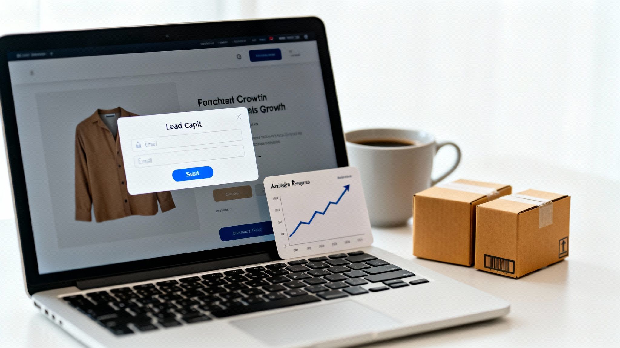
This example works so well because it's clean and gets straight to the point. It clearly states the value—"Sign up and get 10% off"—and only asks for the one thing it needs: an email address. No friction, no confusion.
Not all forms are created equal. It's critical to understand the difference between a truly strategic approach grounded in behavioral science and simply deploying a basic pop-up on your site.
| Attribute | Advanced Lead Capture Forms | Basic Email Pop-ups |
|---|---|---|
| Primary Goal | Generate revenue, build relationships, gather intelligence | Grow the email list |
| Triggers | Sophisticated behavioral triggers (exit-intent, scroll depth, time on page, cart value) | Basic time-based triggers (e.g., show after 10 seconds) |
| Offer | Personalized and context-aware (e.g., offer on a specific product page) | Generic, site-wide offer (e.g., "10% off your first order") |
| Technology | Deeply integrated with ESPs, SMS platforms, and CRM for sophisticated automation | Standalone or basic integration |
| User Experience | Feels helpful, timely, and psychologically compelling | Often feels interruptive and manipulative |
Advanced strategies are built on behavioral psychology and smart automation, focusing on driving sales. Basic pop-ups often just prioritize grabbing an email at any cost, sometimes at the expense of user experience. One uses sophisticated triggers to show the right offer at the perfect moment, while the other relies on generic timers that can feel disruptive and cheapen the brand.
The real goal here is to move beyond simple digital tricks and into the realm of sophisticated marketing science. An effective strategy uses principles of anticipation and reciprocity to create a positive user experience that feels helpful, not intrusive.
Consider the ROI difference. A basic form might grow your list. But a strategic form, integrated with a platform like Klaviyo or your SMS provider, can instantly trigger an automated welcome series that converts that new lead into a first-time buyer. That automated workflow turns a simple submission into a direct revenue stream—something every Shopify Plus merchant trying to scale should be obsessed with.
A lead capture form that works isn't just a box on a screen with a few fields. It’s a psychological journey, carefully designed from start to finish. The difference between a form that gets ignored and one that captures thousands of qualified leads boils down to understanding consumer psychology. When brands tap into established behavioral economics principles, they can turn a simple data-collection tool into a conversion powerhouse.
This isn't about manipulation. It's about aligning with the natural way our brains make decisions. By making the process effortless and building trust, conversions follow naturally.
The single biggest enemy of form completion is cognitive load—the mental effort required to complete a task. If a form looks complicated or asks for too much information, visitors will abandon it. Behavioral economics research consistently shows that every additional field you add can decrease your conversion rate.
To combat this, your mantra should be simplicity:
The goal is to make filling out the form feel like an instinct, not a task. Remove every micro-friction that could cause a user to pause and reconsider.
For a masterclass in getting people to say "yes," look no further than Dr. Robert Cialdini’s principles of persuasion. These aren't clever marketing tricks; they are fundamental triggers that drive human behavior, validated by decades of research.
By grounding your form design in behavioral science, you create an experience that resonates on a subconscious level. This is the difference between asking for a lead and earning one.
Here’s an actionable takeaway on how to apply these principles directly to your forms:
Weaving these elements into your form transforms it from a simple request into a compelling, psychologically-sound invitation. For a closer look at this topic, our guide to consumer psychology in marketing is a great resource.
Finally, the most effective lead capture forms generate excitement for what comes next. This is where urgency marketing platforms like Quikly truly excel, moving beyond basic countdown timers to build genuine, palpable anticipation based on psychological principles like scarcity and FOMO (Fear Of Missing Out).
Ditch the boring "Submit" button. Instead, use copy that frames the immediate benefit and creates anticipation. Think "Get My 20% Off Code" or "Unlock Exclusive Access." This language builds excitement for the reward. When you tie that feeling to a limited-time offer or a scarce product drop, that anticipation becomes a powerful motivator for immediate action, driving conversions while protecting your profit margins from the negative effects of perpetual sitewide discounts.
An effective form strategy is all about perfect timing and placement—showing the right form to the right person at just the right moment. The brands unlocking serious revenue are the ones that have moved beyond generic, site-wide interruptions. The goal is to make every form feel like a natural, helpful part of your customer's journey, not a roadblock.
This means you have to master the art of context. A form that works wonders on a product page might fall completely flat in a blog post. By understanding the different types of forms and where they shine, you can create a seamless experience that feels personal and actually drives conversions.
Your toolkit for capturing leads is way more varied than just a simple pop-up. Each type of form has its own specific strength, and the real magic happens when you combine them to build a strategy that hits different user intents across your site.
Here are the heavy hitters and where they excel:
For a deeper dive into making these work for you, our guide on popups for Shopify lays out specific strategies just for ecommerce merchants.
This map breaks down the core psychological drivers that make a form feel compelling and easy to complete.
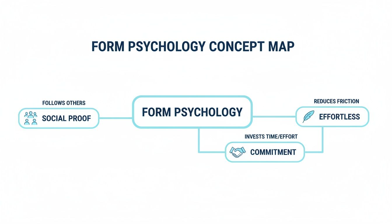
It shows how things like social proof, effortless design, and a sense of commitment all work together to turn a simple form into a powerful conversion tool.
One of the most potent psychological principles in form design is commitment and consistency. The "Breadcrumb Technique," often used in multi-step forms, puts this to work by asking for just a small piece of information first—usually the email address.
That initial, low-effort step gets the user invested. Once they've handed over that little piece of data, the Zeigarnik effect kicks in—our brains are wired to want to finish tasks we've already started. This makes them far more likely to complete the next steps, even if you ask for more info like a name or phone number.
This isn't just theory. An analysis of over 1,500 real-world forms found that asking for an email address as the very first field boosted completion rates by an average of 18% compared to forms that delayed the ask.
By getting the most valuable asset—the email—upfront, you de-risk the entire interaction. Even if a user drops off on step two, you've already captured a lead you can nurture. This one change can have a massive impact on your ROI.
The best lead capture strategies are never one-size-fits-all. To protect profit margins and deliver a personalized customer journey, you must move beyond basic rules like, "show a pop-up after 10 seconds." Advanced targeting is where you stop interrupting and start anticipating customer needs with offers that feel tailor-made.
This approach is rooted in behavioral economics. It’s about recognizing that a visitor’s mindset and goals change dramatically as they navigate your site. A first-time visitor from a social ad needs a different welcome than a loyal customer browsing your most expensive products. When you automate this personalization, you can serve the perfect offer at the exact moment it's most likely to convert.
Simple timers are blunt instruments. They treat every visitor identically, which is a fast track to annoying pop-ups and missed revenue opportunities. In contrast, sophisticated behavioral triggers use a visitor's own actions to determine their intent, allowing you to deploy lead capture forms with surgical precision.
It's the difference between shouting a generic discount and whispering a relevant offer. For example, instead of a generic pop-up, a platform like Quikly can create "Moments" of urgency tied directly to user behavior, making the interaction feel exclusive and perfectly timed. This is next-generation urgency marketing, not a simple timer.
Here are three powerful, actionable triggers to implement:
Great targeting isn't just about when you show a form; it's also about who sees it. Audience segmentation lets you customize your offers based on visitor data, ensuring you always present the most compelling reason to sign up. This is also how you protect your profit margins, because you stop giving away big discounts to people who were going to buy anyway.
The name of the game is relevance. When you match the message to the visitor's context—where they came from, what they're looking at, and how they've acted before—you turn a generic pop-up into a personal concierge.
Consider these segmentation strategies for your Shopify store:
To take this to the next level, it's worth exploring how you can use AI to personalise customer experiences on your site. This allows for even more dynamic segmentation, helping you drive higher conversion rates and get a much better return on your marketing spend.
A lead capture form isn't just a box to collect emails; it's the front door to your entire marketing ecosystem. For Shopify merchants, the real magic happens when that form talks seamlessly with the other tools you rely on to grow your business. This is what turns a simple sign-up into the very first step of a profitable, automated relationship with a new customer.
Think of it like a domino rally. When a new lead signs up, it shouldn't just land in a spreadsheet. That single action should instantly kick off a chain of events—a welcome email from Klaviyo, an entry into an SMS drip campaign, a new profile in your CRM—all happening behind the scenes without you lifting a finger.
The purpose of integration is to automate the customer journey from the first interaction. When your lead capture forms are connected to your Email Service Provider (ESP) like Klaviyo or an SMS platform, you can immediately funnel new subscribers into specific, high-converting sequences.
This creates a responsive marketing machine that’s always working for you.
Once you’ve got those leads, efficient subscriber data management is everything. Integrating your forms with a solid system ensures all that prospect info is organized and ready to use, preventing valuable data from slipping through the cracks.
This is what a typical Shopify app integration dashboard looks like—it’s the command center for connecting all your marketing tools.
As you can see, this is all about letting data flow freely between your forms, email marketing, and analytics platforms.
When you're running an enterprise-level brand on Shopify Plus, your integration strategy becomes absolutely crucial for managing scale. A disconnected tech stack creates data silos and missed opportunities that can seriously stunt your growth. The goal is to build a scalable setup where lead capture forms feed clean, real-time data into every corner of your business.
For a Shopify Plus merchant, a lead capture form is a critical data source that should inform everything from marketing automation and customer support to inventory forecasting. Seamless integration is not a luxury; it’s a requirement for scalable growth.
This means your form tools need robust APIs that can plug into custom-built systems or advanced analytics platforms. It also means building sophisticated workflows that can handle thousands of sign-ups a day without breaking a sweat, automatically segmenting high-value leads and sending them down personalized, revenue-focused funnels.
Choosing the right collection of apps for your Shopify store is the foundation for building an integrated, powerful marketing machine that grows with you. Get this right, and every single lead you capture has the maximum potential to impact your bottom line.
Hitting "publish" on your lead capture form isn't the finish line—it’s the starting block. The real work, the kind that actually drives revenue and protects your profit margins, begins with data-driven optimization. By constantly measuring what works and testing key elements, you can turn a static signup box into a dynamic, high-performing asset that learns from your audience.
This process is about much more than just counting emails. The end game isn't just to grow a list; it’s to efficiently acquire customers who will stick around. A form that captures thousands of low-quality leads can be less profitable than one that captures a hundred highly qualified prospects ready to buy.
To get a real sense of your form's business impact, you need to look past vanity metrics. The submission rate is a decent starting point, but it barely scratches the surface.
Focus on the numbers that connect directly to your bottom line. These three are the heavy hitters:
This is where the magic happens. A/B testing, also known as split testing, is the engine that drives optimization. It's a straightforward concept: you create two versions of a form (Version A and Version B) with just a single element changed, show them to different segments of your audience, and see which one comes out on top. This methodical approach takes all the guesswork out of the equation and gives you clear, actionable wins.
According to consumer psychology, tiny tweaks in language or design can have a surprisingly massive impact on our decisions. Testing lets you uncover the subtle triggers that click with your specific audience, turning small improvements into significant lifts in revenue.
Ready to start? Here is an actionable takeaway. Begin by testing these high-impact elements:
Finally, don’t look at data privacy and compliance with regulations like GDPR and CCPA as a chore. See it for what it is: a massive opportunity. When you’re transparent about what data you're collecting and why you need it, you build incredible trust from the get-go.
A clear link to your privacy policy and unambiguous consent checkboxes do more than just keep you on the right side of the law—they send a powerful signal to users that you respect them and their data. That foundation of trust is absolutely essential for turning a brand-new lead into a loyal, long-term customer.
Diving into the world of lead capture forms can feel a bit overwhelming, but a few core ideas can clear up the most common sticking points. Once you get these down, you'll be able to fine-tune your strategy, get past any roadblocks, and start turning those forms into some of your best conversion tools.
Think of this section as a straightforward chat about the questions we hear brands ask the most, all based on how real shoppers think and what we know drives business results.
This is the classic balancing act between getting the data you need and not scaring people away. It all comes down to a trade-off between information and friction.
For something simple at the top of your funnel, like a newsletter signup, less is always more. Seriously, stick to one or two essential fields. Just asking for an email address lowers the mental barrier and gets you the most signups, period.
But what about for bigger asks, like a custom quote or a B2B demo? In those cases, you absolutely need more info to qualify the lead, and that’s okay. The smartest way to handle this is with a multi-step form. Ask for the email on step one—that way, you've secured the lead right away. This little trick uses a psychological nudge called commitment; once someone starts a process, they’re far more likely to see it through to the end.
The best incentive is one that feels like an immediate, valuable win for your customer and lines up perfectly with why they're on your site in the first place. For e-commerce brands, it almost always boils down to two heavy hitters:
Of course, there are other solid options. You could offer access to exclusive content, give them a heads-up on new product drops, or enter them into a giveaway. The real secret is to test what resonates with your audience. Your goal isn't just to get the most signups, but to find the offer that sparks the most profitable first-time purchases. It's about protecting your margins while bringing in new revenue.
There’s no magic "best" spot for a form; where you put it depends entirely on the context. A truly effective strategy is a mix-and-match approach, using different types of forms in various places, triggered by specific things a visitor does. This lets you maximize conversions without getting in the way of their shopping.
For general list building, a pop-up that appears after a few seconds or when someone is about to leave is perfect for your homepage or popular category pages. If you're trying to capture leads who are really engaged with a certain topic, an inline form embedded right inside a relevant blog post is your best bet.
Want a less in-your-face option for a site-wide offer? A slide-in form is a great choice. And for that high-intent traffic coming from your paid ads or social campaigns, nothing beats a dedicated landing page. It creates a focused, distraction-free zone built for one thing and one thing only: getting that conversion.
Ready to transform your lead capture strategy with the power of urgency marketing? See how Quikly can help you convert more visitors into customers. Get started with Quikly today!

