
ecommerce conversion
customer experience strategy
digital customer experiences
Think of a lead capture form as the first handshake between your brand and a future customer. It’s that simple box on your site asking for a name and email, usually in exchange for something cool like a discount or early access. More than just a tool, it’s how you turn anonymous website visitors into real, tangible connections.

It's tempting to see a lead capture form as just an email collection box. But that's like saying a storefront is just a door. In reality, it’s one of the most powerful engines you have for driving revenue, building relationships, and protecting your profit margins.
Every person who lands on your Shopify store represents an investment—especially if they clicked through from a paid ad. If they leave without buying or giving you their contact info, that investment vanishes.
An optimized form is your best defense against that loss. It’s the critical first step in turning expensive traffic into a sustainable source of income, moving a visitor from a one-time interaction to a long-term relationship. Once you have that direct line of communication, you can drive repeat purchases, boost customer lifetime value (LTV), and retarget your most interested shoppers without paying for ads over and over again.
This isn't just about building a bigger email list. It’s about building a proprietary audience you can talk to on your own terms. To really get a feel for how this works, it’s worth brushing up on the fundamentals of lead generation marketing.
The secret is out. Businesses are catching on to the powerful link between lead capture and the bottom line. The global market for lead capture software was valued at around USD 2.8 billion in 2025 and is expected to more than double to USD 5.8 billion by 2035.
This explosion isn't just a trend; it's a fundamental shift. It signals that smart brands now see lead capture not as a simple marketing task, but as a core business function. If you're looking for more ways to grow your audience, our guide on building an email list is a great next step.
A well-built lead capture form isn't just a nice-to-have—it directly pads your bottom line. Let's break down the essential components that make this happen.
This table offers a quick-reference breakdown of the essential components that turn a standard form into a revenue-generating asset.
| Component | Purpose | Impact on Conversion |
|---|---|---|
| Compelling Headline | Grab attention and state the core benefit immediately. | A strong headline can double the form’s submission rate by making the value proposition clear. |
| Clear Value Exchange | Answer the user's question: "What's in it for me?" | Offering an irresistible incentive (e.g., 20% off, free guide) dramatically increases sign-ups. |
| Minimal Form Fields | Reduce friction by asking only for essential information. | Each additional field can decrease conversion rates by up to 11%. Keep it simple. |
| Strong Call-to-Action | Use clear, action-oriented text on the button. | "Get My 20% Off" converts better than a generic "Submit" because it reinforces the benefit. |
| Social Proof/Trust Signal | Add testimonials, review scores, or subscriber counts. | Seeing that others trust your brand reduces hesitation and builds confidence, lifting sign-ups. |
| Mobile-First Design | Ensure the form is easy to use on any device. | With over 60% of e-commerce traffic on mobile, a non-responsive form kills conversions. |
A great form isn't an accident; it's a strategic combination of persuasive copy, smart design, and a clear understanding of what your audience wants. Here's how these elements come together to impact your finances:
A lead capture form that actually works isn’t a lucky guess. It’s engineered. The best ones tap into a deep understanding of human psychology, gently guiding someone toward hitting "submit" without a second thought.
This is about making the experience feel natural and low-friction by aligning your form with how people already think and make decisions. You’re building trust, lowering hesitation, and making it feel like a no-brainer for them to give you their email.
We all think we want more options, right? But psychologically, that's not quite true. The Paradox of Choice is a well-known concept in behavioral economics that shows when we're faced with too many choices, our brains tend to shut down. We get overwhelmed and just walk away.
A form with too many fields triggers this exact paralysis. Consumer psychology studies have shown that every extra field you add can slash your conversion rate by up to 11%.
Actionable Takeaway: A simple form with just three fields—name, email, and a single, clear purpose—will almost always crush a complex one. The goal is to ask for the absolute bare minimum you need to start the conversation.
By keeping it simple, you make the decision to sign up feel instant and easy. This is often the single biggest lever you can pull to directly boost your submission rates and get more out of your ad spend.
Ever had someone do you a favor and felt an immediate urge to return it? That's Reciprocity at work. It's a powerful social norm that’s baked into all of us, and your lead capture form should never feel like a one-way street where you just take, take, take.
Instead, you need to frame it as a fair trade. Give them something valuable right away.
This completely changes the dynamic from an "ask" to an "offer." You’re giving first, which makes the user feel valued and way more likely to give you their email in return. It’s the first step in building a positive relationship that lasts.
Before anyone hands over their email address, they have to trust you. Social Proof is a psychological principle stating that we tend to follow the actions of others because we assume they know what they’re doing.
For your lead capture form, this is your secret weapon for building instant credibility. Ditch the generic "Sign Up" and use language that shows you have a real, thriving community.
This one small tweak does a huge amount of heavy lifting. It tells new visitors that thousands of others have already made this choice and loved it, which reduces their feeling of risk. It's often the final nudge someone needs to go from a hesitant browser to a happy new lead.
Once you’ve figured out the psychology that makes someone want to fill out your form, the next job is making it incredibly easy for them to actually do it. A frictionless form just feels right—it's intuitive, quick, and seems like a natural next step in their shopping journey, not some annoying roadblock.
Think of it this way: you’re trying to remove any and all mental hurdles. Every confusing field, clunky layout, or poorly worded button adds to what psychologists call cognitive load. That’s the mental effort a person has to spend to get something done. As that effort goes up, your conversion rates go way, way down. Your goal is to make the decision to sign up feel instant and effortless.
Let's start with the visual stuff—the layout and structure that guide a user’s eyes and actions. Small tweaks here can make a huge difference in how many people complete your form, especially on mobile, where you have about two seconds to keep their attention.
Actionable Takeaway: A well-designed lead capture form doesn't make the user think. It anticipates their needs, guides their actions, and removes any and all sources of hesitation, leading directly to higher submission rates.
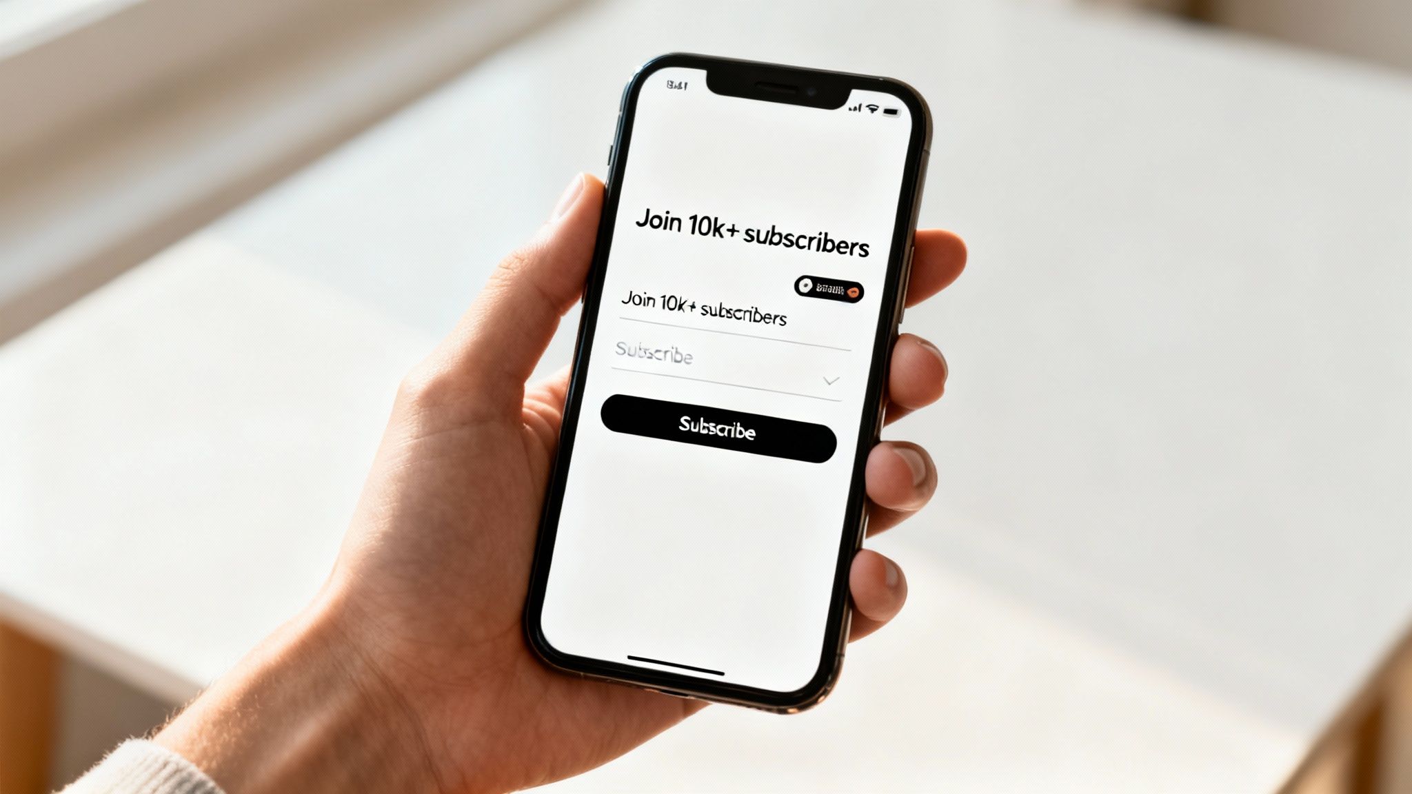
The words you use are just as critical as the layout. Your copy needs to be short, punchy, and all about the benefit to the user. Ditch the boring "Submit" button and go for something that reinforces the payoff, like "Get My 20% Off!"
Every little interaction matters, too. Take error messages, for example. They should be helpful, not scolding. Instead of a harsh "Invalid Email," a gentler "Please enter a valid email address" works wonders. That small shift in tone can stop someone from rage-quitting your form. Our guide to creating effective popups for Shopify dives deeper into making these experiences more user-friendly.
Here's a more advanced trick: use hidden fields to collect data without asking for it. This lets you personalize their experience down the road without adding another question to the form. In fact, some research shows that using hidden fields can boost completion rates by 4.8%. You can discover more insights about these LinkedIn lead generation statistics and how similar ideas apply to form design.
When you nail these practical design elements, you create a seamless experience that feels helpful, not demanding.
A slick, frictionless form is a great start, but it's just the foundation. If you really want to see your revenue and ROI increase, you need to give people a reason to act now. This is where applying behavioral science turns a passive form into an active conversion machine. It's all about shifting a shopper's mindset from "I'll get to this later" to "I can't miss this."
We're not just talking about slapping a generic countdown timer on your site. Sophisticated urgency marketing is much smarter than that. It taps into powerful, hard-wired human drivers like scarcity (things are running out!), FOMO (the fear of missing out on a deal everyone else is getting), and anticipation (the buzz around an upcoming event).
When you weave these triggers into your lead capture strategy, you completely change the conversation. Signing up is no longer a boring transaction for a 10% off coupon. Instead, it becomes the only way to get in on an exclusive, time-sensitive opportunity. This is how you build a dynamic, engaged community that drives revenue, not just a static email list.
For Shopify stores, this means transforming your lead capture form into a gateway for something your customers actually care about. Ditch the generic "Join our newsletter" and make the form an exclusive entry point for something genuinely compelling.
Of course, none of these psychological triggers work if your form itself is a mess. The best practices below are the building blocks that make sure your form is easy to use, allowing the urgency to do its job.
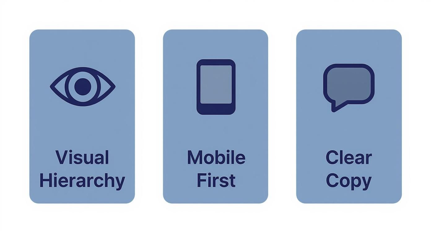
These design fundamentals—a clear visual path, mobile-first thinking, and punchy copy—are what turn a visitor's interest into a confirmed submission.
There are plenty of apps that can put a countdown on your site. The problem is that most of them feel disconnected from any real business goal and only focus on email capture. Strategic urgency is different. It’s about creating an entire event—what we at Quikly call a "Moment"—that’s built around your inventory, revenue goals, and brand story. It’s a bigger, more holistic approach that generates revenue, not just leads.
Actionable Takeaway: By linking your lead capture form to a tangible, time-sensitive event, you elevate it from a simple data collection tool to a primary driver of both immediate sales and long-term customer loyalty.
This approach also has a massive impact on your bottom line. Instead of just running sitewide discounts that eat away at your margins, you can use these high-engagement moments to drive full-price sales and clear out inventory with surgical precision. It turns lead capture into a profitable, brand-building exercise that excites your audience while protecting your profits.
A tidal wave of sign-ups feels great. But a high submission rate is just a vanity metric if those leads never turn into actual revenue. True optimization isn’t about collecting more emails; it’s about acquiring more profitable customers.
To do that, you have to stop thinking about the form as the finish line. It's the starting line. You need to connect the dots between that initial sign-up and the final sale. This is where most brands give up, but it’s precisely where the real growth is hiding.
To get a real sense of your form's financial performance, you need to be tracking a few specific Key Performance Indicators (KPIs). These numbers tell the whole story, from a flicker of interest to long-term customer value.
When you focus on these ROI-driven numbers, you can make data-backed decisions that actually protect your profit margins, instead of just chasing a bigger email list for the sake of it.
Once you have the right metrics in place, you can start methodically improving your form’s profitability with A/B testing. This isn’t about tweaking button colors. It’s about changing one core element at a time to see what drives not just more sign-ups, but more valuable sign-ups.
Actionable Takeaway: A/B testing isn't a hunt for one "perfect" form. It's about creating a continuous feedback loop. You're constantly refining your approach to attract higher-quality leads who are far more likely to become loyal, profitable customers.
Start by testing the variables that have the biggest impact—the ones directly tied to the value you’re offering:
Every test gives you another piece of the puzzle. You start to understand the deep-seated motivations of your most profitable customers, allowing you to turn a simple lead capture form into one of your most powerful, revenue-generating assets.
Getting a lead is just the first domino to fall. The real magic happens when that new contact is instantly plugged into your marketing machine. A lead capture form that just sits there, disconnected from your other tools, is a huge bottleneck—creating tedious manual work and letting hot leads go cold.
The final, and most critical, step is building a seamless bridge between your form and your Shopify ecosystem. This creates a completely hands-off workflow from the moment someone signs up to their very first purchase.
For any brand trying to scale, this isn't a nice-to-have; it's a must-have. When you automate the flow of lead data into platforms like Klaviyo or your favorite SMS tool, you can trigger sophisticated welcome and nurture sequences the second a user hits "submit." This immediate, relevant communication is exactly how you turn fresh interest into revenue while your brand is still top-of-mind.
Think of this integration as the central nervous system for your marketing. A new subscriber from your lead capture form should automatically get a welcome email, be added to a specific audience segment based on what they signed up for, and maybe even get a follow-up text a few minutes later. Trying to manage that kind of responsiveness by hand is simply impossible once you start growing.
Clunky, manual processes are silent profit killers. Just look at other high-touch environments like trade shows, where a staggering 40% of captured leads are never even entered into a CRM. You can read the full research on these lead capture challenges to see how much revenue gets left on the table. A fully integrated tech stack for your Shopify store solves this problem by making sure no lead ever slips through the cracks.
Your lead capture form shouldn't be an isolated island of data. It needs to be the starting point for a unified strategy. By wiring it directly into your core platforms, you create a powerful feedback loop that constantly enriches customer profiles and fuels better, more personal marketing down the line.
Here’s what that connected stack looks like in action:
This kind of automation transforms your form from a simple data collection tool into the command center for your entire customer journey. To go deeper on this, check out our guide on choosing the right ecommerce marketing automation platform to build a truly streamlined workflow.
Ready to transform your lead capture from a simple form into a revenue-generating event? Quikly integrates urgency marketing with your tech stack to create high-stakes moments that not only capture leads but drive immediate sales. See how Quikly can amplify your marketing efforts.

