
ecommerce conversion
customer experience strategy
digital customer experiences
Ever had a customer on the very brink of buying, only to see them vanish? An exit-intent pop-up is your last, best chance to win them back. It’s a message that appears the exact moment a visitor’s cursor signals they’re about to leave your site. Think of it as a final, intelligent attempt to re-engage them with a compelling offer, recover a lost sale, or capture an email. When grounded in consumer psychology, the best exit-intent pop-ups convert between 2-4% of abandoning visitors—a simple tactic that can add a significant new revenue stream.

With average cart abandonment rates hovering around a staggering 70%, it's a harsh reality that most shoppers who add items to their cart will never actually check out. This isn’t just a lost sale; it's a massive drain on your marketing budget and ROI. An exit-intent pop-up acts as an automated safety net, stepping in at the most critical moment of the customer journey.
It flips a moment of abandonment into an opportunity. Unlike a generic email form that pops up when someone first lands on your site, a smart exit-intent strategy is grounded in behavioral science. It taps into specific psychological triggers to turn hesitation into decisive action.
At its heart, a great exit-intent pop-up is a masterclass in applied consumer psychology. It’s not about interrupting someone. It’s about responding to their unspoken objections with a perfectly timed solution.
One of the most powerful principles at play here is loss aversion. This is a concept from behavioral economics that says the pain of losing something feels twice as powerful as the pleasure of gaining something of equal value. An exit pop-up that offers a limited-time discount frames the choice perfectly: the visitor isn't just gaining a discount, they are actively avoiding the loss of a fantastic deal. That subtle shift in perspective is incredibly persuasive.
Then there’s the Zeigarnik effect, which is our brain's tendency to obsess over incomplete tasks. An abandoned cart is an unfinished task begging for completion. The pop-up serves as a gentle nudge, reminding the shopper what they started and giving them a fresh incentive to finish. That little psychological pull can be the difference between a forgotten cart and a finalized order. You can dive deeper into how these ideas work by exploring the fundamentals of consumer psychology and why urgency causes action.
Many pop-up apps focus on one thing: grabbing an email address. While building your list is valuable, this narrow approach leaves significant revenue on the table. This is where advanced platforms like Quikly change the game by reframing the entire purpose of exit-intent. The goal shifts from simple list-building to immediate revenue generation and protecting your profit margins.
An exit-intent pop-up shouldn't just ask for an email; it should make a compelling case for completing the purchase right now. This transforms it from a marketing tool into a direct sales driver.
This is where intelligent behavioral triggers really shine, far outperforming a basic countdown timer. Instead of blasting every visitor with the same generic offer, a smarter system can present a high-value discount only to a user abandoning a cart over $200, protecting your margins on smaller orders. It’s about creating an authentic sense of urgency that feels helpful and personalized, not cheap or manipulative. This scientific approach ensures your final offer isn't an annoyance, but a welcome solution that genuinely boosts conversions while protecting your bottom line.
The magic of an exit-intent pop-up isn't the technology. It's the offer. A generic, one-size-fits-all discount might catch a few people, but you're mostly just chipping away at your profit margins without solving the real reason they were leaving in the first place. Crafting an offer that actually works means getting into your shopper's head and understanding what they were doing right before their cursor drifted toward that close button.
The golden rule is to match the offer's value to the visitor's intent. Someone who took a quick glance at a product page is in a completely different headspace than a shopper who is about to ditch a $350 cart. That second person is incredibly close to purchasing. They just need the right nudge, making a perfectly timed, targeted offer incredibly powerful.
A simple percentage-off coupon is the default for a reason—it's easy. But leaning on it too heavily can devalue your brand over time. Even worse, you'll train your customers to simply wait for the pop-up before ever buying at full price. A much smarter approach is to mix up your offers based on the context of why someone is leaving.
Instead of just slapping 10% on everything, think about these alternatives:
To get the most out of your pop-ups, you should see them as just one part of your broader strategies to reduce cart abandonment. When used correctly, they can turn potential losses into big wins.
This is where you separate the pros from the amateurs. A generic countdown timer that just resets for every visitor? Most shoppers see right through that. It feels cheap and manipulative. Real urgency comes from genuine scarcity and believable triggers.
Instead of a basic timer, platforms like Quikly let you build behavior-triggered "Moments." This means you can create a truly limited, one-time offer. Imagine an exit pop-up that offers 15% off exclusively to the next 25 people who check out. That creates real Fear of Missing Out (FOMO) because the limit is real. It's not a sales gimmick; it's an exciting, competitive event. To get this right, you have to know what consumers are looking for in an incentive.
By anchoring your offer in real scarcity—a limited quantity, a short claim window, a tiered release—you tap into powerful psychological drivers that compel action far more effectively than a looping timer ever could.
The data backs this up. Smart exit-intent pop-ups can salvage a significant percentage of would-be lost sales. The ROI is clear: a compelling, urgent offer shown at the exact moment of hesitation works. This transforms a simple pop-up from a basic tool into a powerhouse for generating revenue, acquiring customers, and even managing inventory with surgical precision.
Bringing your exit-intent pop-up strategy to life on Shopify is actually pretty straightforward, especially once you have the right app and a clear plan. The process really boils down to picking a tool from the Shopify App Store and then fine-tuning the triggers to match your goals. The last thing you want is an annoying, intrusive pop-up—the goal is to make every interaction feel helpful.
The first step is picking an app that does more than just ask for an email. Plenty of apps can do that. You want a platform built to generate revenue by using smart, behavior-based triggers. This is a fundamental shift in thinking: you’re not just growing a list, you’re actively recovering sales and boosting AOV at the most critical moment.
This simple flow is incredibly powerful when you see it in action.
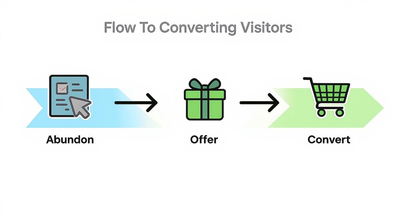
As the visual shows, a well-timed pop-up intercepts a visitor's departure, gives them a compelling reason to stick around, and steers them right back toward making a purchase.
Once your app is installed, the real work begins. This is where you get to apply all those smart psychological principles directly to your store's setup. One of the most critical settings to get right is page-level targeting. You should never have an exit pop-up fire on your order confirmation page or during the final checkout steps. It just creates confusion and can even kill a sale.
Instead, concentrate your efforts on the high-exit pages where a thoughtful offer can make a huge impact:
The best pop-up strategies are never one-size-fits-all. When you tailor your triggers and offers to specific pages and what the user is actually doing, you transform a generic pop-up into a personalized, helpful touchpoint.
This is also a perfect time to leverage Shopify customer tags for much deeper segmentation. Imagine creating a rule that shows a special "Welcome Back" discount only to returning customers (identified by a tag), while new visitors see a first-time buyer offer. This kind of personalization makes your offers dramatically more relevant and effective. Our guide on popups for Shopify dives even deeper into these kinds of advanced strategies.
The difference between a basic pop-up app and an advanced platform often comes down to the trigger logic. Basic apps react to simple movements, while advanced tools can interpret complex user behavior to deliver the perfect offer at the perfect time.
| Trigger | Basic Pop-Up App | Advanced Urgency Platform (e.g., Quikly) |
|---|---|---|
| Mouse Movement | Simple "cursor leaves window" detection. | Detects velocity and trajectory, distinguishing between accidental moves and true intent to leave. |
| Cart Value | Can show an offer if cart has items. | Can trigger different offers based on specific cart value thresholds (e.g., "Add $10 more for free shipping"). |
| Session Behavior | Limited to page views or time on site. | Considers dwell time on specific products, scroll depth, and historical purchase data to inform the offer. |
| Customer History | Treats most visitors the same. | Uses customer tags and past order data to segment offers for new vs. returning vs. VIP customers. |
As you can see, the ability to act on nuanced behavioral cues is what separates a pop-up that simply exists from one that actively drives revenue.
Your exit-intent pop-up shouldn't be an island. Its true power is unlocked when it’s plugged into the rest of your marketing stack, creating automated and cohesive customer journeys.
This means your pop-up tool needs to talk directly to your other platforms. For most Shopify and Shopify Plus merchants, that means a few key integrations:
When these connections are solid, you have a powerful, automated system. A lead doesn't just get added to a spreadsheet—they immediately enter a thoughtfully designed follow-up sequence that maximizes your chance of conversion and helps build a real customer relationship. This kind of automation saves your team countless hours and makes sure no lead ever slips through the cracks.
Generic exit-intent pop-ups deliver generic results. Blasting every visitor with the same "10% Off!" offer is a fast way to tank your profit margins. To turn these pop-ups into a real revenue engine, you have to stop thinking one-size-fits-all.
The goal is to make every offer feel personal and perfectly timed. It's about shifting from a megaphone announcement to a one-to-one conversation that directly addresses why a specific visitor might be leaving. That requires smart segmentation. By targeting users based on specific criteria, you deliver hyper-relevant messages that don't just convert—they protect your profits by avoiding needless discounts.
Imagine this: a visitor with a $250 cart sees an offer for 20% off, while a first-time visitor from an Instagram ad sees a free shipping offer. That's the power of segmentation. Instead of one site-wide pop-up, you’re creating a whole portfolio of targeted offers that only trigger when the conditions are just right.
This strategy is all about ROI. A great campaign delivers the minimum effective dose of an incentive needed to seal the deal, preserving your average order value (AOV) and your bottom line.
Here are a few powerful ways to segment your offers:
The core idea here is relevance. A message that acknowledges who the visitor is and where they came from will always outperform a generic one. It’s the difference between being an interruption and being genuinely helpful.
Ready to get more sophisticated? You can layer on behavioral and geographic data to make your pop-ups incredibly effective. This is where you move from basic app functions to psychology-driven marketing.
For instance, you can target based on what people do on your site. If a shopper has viewed three or more products in your "Summer Dresses" category, they're clearly interested. A pop-up offering a bundle deal on that specific category ("Buy 2 Dresses, Get 1 Free") can be the perfect nudge they need to buy.
Geographic targeting opens up some great opportunities, too.
This is the kind of personalization that top-performing brands use to pull ahead. Data shows that while the average pop-up converts at an impressive 31.6%, the top 10% of campaigns crush it with a conversion rate over 40%. Their secret often comes down to smart targeting that combines urgency with personalization. As you can see in this popup conversion benchmark report, understanding user context is what ensures your final message isn't just seen, but felt.

Getting your exit-intent pop-up live is just the starting line. The real money is made in the follow-through: analyzing what’s working, testing new ideas, and making adjustments based on cold, hard data. If you’re not in a constant feedback loop, you’re just guessing.
The goal here is to get past the vanity metrics. Sure, a high impression count feels good, but it doesn't pay the bills. You need to zero in on the numbers that actually track back to profit.
To get a real picture of your pop-up's performance, you have to look at the metrics that translate directly to revenue. Forget about simple open rates and focus on these instead.
To really get the most out of your campaigns, it helps to have a solid grasp of the fundamentals, like how to measure marketing ROI. That foundational knowledge helps you see the true financial impact of your pop-up strategy.
Never assume your first idea is your best one. The engine of optimization is continuous A/B testing, which lets you systematically improve your pop-up by changing just one thing at a time. It’s a scientific approach that takes the guesswork out of the equation and lets your customers tell you what they actually want.
Start with the elements that have the biggest potential impact. You’d be surprised how much a small tweak to one of these can move the needle.
A classic mistake is testing too many things at once. If you change the headline, the offer, and the button color, you have no idea which change made the difference. Isolate one variable per test to get clean, actionable data.
Here’s where I’d recommend starting your A/B testing roadmap:
Need proof this works? One ecommerce brand ran an exit pop-up with a simple 10% discount offer. Out of 1,000 visitors who saw it, they captured 239 email addresses and converted 39 of them into new customers.
The result? Over $78,000 in extra revenue. That's money that was literally walking out the door.
Even with the best strategy in place, it's natural to have a few questions before you dive in. Getting these cleared up is the key to launching with confidence, making sure your pop-ups feel like a helpful part of the experience and actually drive results.
Let's tackle some of the most common questions we hear from merchants.
This is probably the biggest hesitation for most store owners, and understandably so. The good news is, the answer is a clear no—if you do it right.
Google penalizes those annoying, full-page ads that block content the second you land on a mobile site. Exit-intent pop-ups are different. They only show up when a user’s behavior—like moving their mouse to the close button—signals they were already on their way out. They aren't blocking content for a new arrival.
Think of it like great customer service in a physical store. It's that final, helpful attempt to solve a visitor's problem or offer a little something extra just as they're hesitating at the door. The key is to add value, not friction.
To make sure your pop-ups are an asset, not an annoyance:
Success often comes down to sidestepping a few critical mistakes that can sink even the smartest strategy. Most of the really damaging errors boil down to a one-size-fits-all approach that completely ignores why a specific user might be leaving.
Here are the biggest pitfalls we see time and again:
To really understand the ROI, you have to look past a single conversion rate metric. You need a bigger picture that shows the full impact on your revenue and how it's helping you acquire new customers.
To get the complete story, you need to track three core areas:
By pulling these data points together, you can build a powerful business case that shows exactly how turning moments of hesitation into opportunities is impacting your growth.
Ready to turn abandoning visitors into loyal customers? Quikly’s advanced urgency marketing platform helps you create sophisticated, psychology-driven exit intent campaigns that drive immediate revenue while protecting your profits.

