Tested conversion rate optimization ideas every e-commerce website can use

It goes without saying that the e-commerce business niche is quite competitive. So here comes the question: Are you doing as much as you can to win this race?
When in doubt, conversion rate optimization (CRO) is precisely what you need to focus on first. In simple terms, it’s a system of steps to get more sales without increasing traffic.
Do you want to adopt some CRO tricks, but you’re not sure how? You’re in the right place. Take a look at this list of tested-and-tried CRO ideas.
Idea #1: Optimize your checkout ASAP
Your success in leading prospects through the checkout process depends a lot on forms. The crucial step here is to cut the form length. The more fields there are, the more frictions, and fewer purchases. Just stick to the essentials. Emails are one piece of data you most definitely need. With emails, you are able to reach out to visitors and convince them to buy.
Another simple, yet effective step in improving your checkout conversion rate is adding a progress bar. People like to understand where they are in the checkout process and how much time it may take to be done.
Along with progress, there is more information that prospects always search for: Can I return it? What are the shipping details? Is this secure? Deal with their most common uncertainties by including the answers upfront.
Idea #2: Pull important information up on stage
You may think that putting contact information for support on the top of the site isn’t a big deal. However, this no-brainer step usually boosts conversions. The other things you should always feature prominently on the site include:
1. Free shipping information (the charm of free shipping is irresistible)
2. Section for sales and specials that stands out
3. Eye-catching search bar
4. Compelling site-wide benefits bar below the header
5. Reviews (both negative and positive)
6. Fast-selling section (or "Trending," if you will)

KOHL’S displays free shipping information and discounts
Idea #3: Add social proof
People tend to trust something if other people have approved it. Therefore, adding social proof elements to your e-commerce site may significantly increase the conversion rate. Online reviews? Great choice, but you can go an extra mile here. CRO tools like crowdy.ai offer customizable widget notifications that display recent conversions (opt-ins, sales, etc.).
Idea #4: Offer the ability to create wish lists
Wish lists are a smart way to remind users who have not made a purchase about the things they’ve liked. Here they can collect a bunch of desired items during the consideration phase. Chances are, the prospects will be ready to order in the future. Don’t lose this golden opportunity.
What’s more, wish lists can help you re-engage prospects. If visitors opt-in for email notifications (you should always leave the "Subscribe" button in full sight), you can always reach out to them with sweet discounts on the saved items.
Idea #5: Stall exits with pop-ups
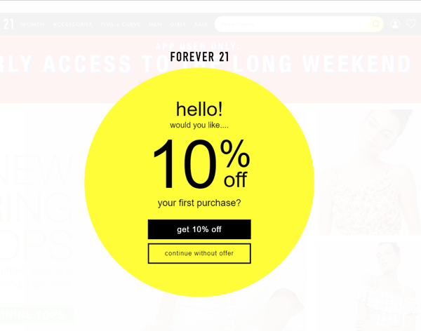
Exit pop-ups are your last chance to make prospects convert. Re-engaging existing visitors with a discount tends to be cheaper than attracting new ones. So don’t miss the opportunity, and test out as many exit pop-up variations as possible. Copy, color, button size, images, calls-to-action —discover which design converts better.
Here’s an example from Forever 21. The pop-up offers an attractive discount in order to convert first-time website visitors:

Idea #6: Adopt live chat
Live chats have gained great popularity. They can help increase conversion rates by engaging your visitors, addressing their challenges during the sales funnel and building brand loyalty. What’s more, anonymous communication gives prospects more comfort while discussing their concerns.
Important note: Adopt a live chat only if you are truly available, at least during business hours. Alternatively, a "dead" chat makes visitors doubt your ability to maintain a high-level service. It would be better to not implement one at all if you can’t be there when they want to chat.
Idea #7: Offer compelling service
Visitors expect a high service standard (and deserve it). Your store doesn’t offer free shipping? Prospects will buy somewhere else. Seventy-six percent of digital buyers indicate it as an important part of decision-making. If you’re not offering free shipping yet, find a way to do it to maximize your sales.
Having a good product return policy is the second must-have. Try to make it as seamless and painless as possible. Moving forward, expanding payment options is another conversion rate booster. People tend to cancel a purchase if their preferred payment method isn’t available. Various payment options like PayPal will help you convert visitors into buyers more easily.
Idea #8: Boost your average order size with the help of upselling
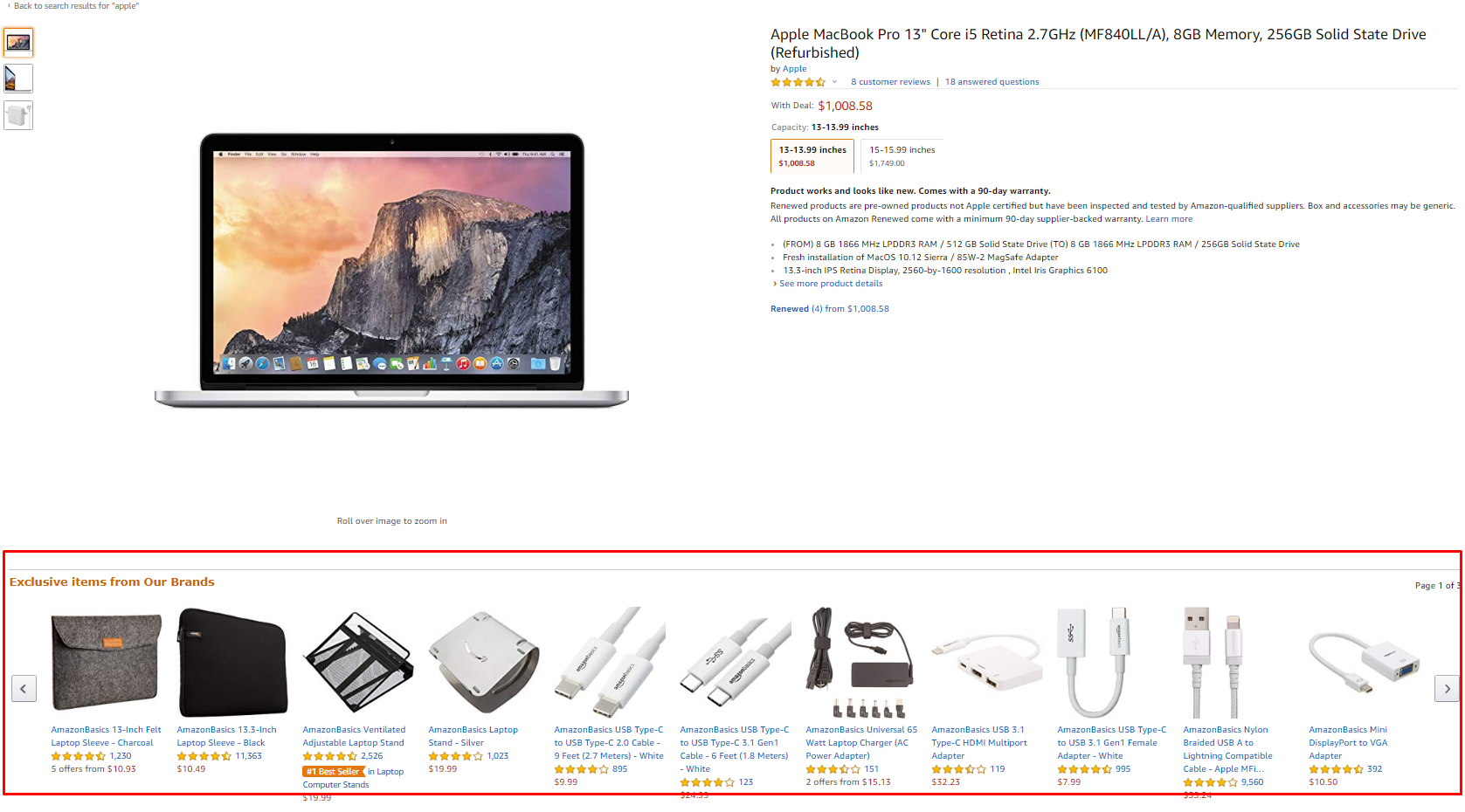
I bet you have already been a victim of upselling. Remember that moment when an online store offered you complementary products immediately after you added something into your cart?
This no-brainer trick is a goldmine for online stores. The golden rule here is to offer those related items which are 60 percent cheaper than the product in your cart.
To make upselling truly beneficial, use dynamic product recommendations to ensure all prospects see the most relevant items. Another technique to increase the purchasing heat is to offer some discount in the case of buying more items.

Amazon’s section of complementary products
Idea #9: Use cart abandonment software
On average, 54 percent of visitors abandon their shopping carts. But there’s no reason to give up. If people come to your site, enter their email, put items in the cart and then leave, abandoned cart software is exactly what you need. This kind of tool helps business owners to engage and convert prospects. Put simply, they send out emails which contain special offers based on items abandoned in carts. The most robust ones, like Privy, create a tiered abandonment strategy that fits your unique business needs and converts prospects.
Wrapping up
Conversions don’t just happen: You should optimize and constantly test for the sake of sales. There are neither things that always work nor something that never works. What’s more, websites are highly contextual and require a unique approach.
A good place to start? Implement one idea at a time, measure the results, make some tweaks if needed, measure the outcome again, repeat tweaking. Having done so, you can move to the next conversion rate tactics.

Julia Samoilenko is a content writer at Chanty — a simple, AI-powered team chat. This powerful and free Slack alternative is aimed to increase team productivity and improve communication at work. With five years of experience in digital marketing, Julia is responsible for Chanty’s online social media presence and public relations.

