
ecommerce psychology
brand loyalty
best brand experiences

A truly conversion-optimized website is more than a page that gets a lot of clicks. It's a dynamic sales engine, built on a deep understanding of consumer psychology and behavioral economics.
This isn't about one-and-done fixes. It's a constant process of refining everything from the user experience (UX) and persuasive copy to trust signals and the subtle psychological triggers that encourage a purchase. For Shopify merchants, getting this right means turning website traffic into predictable, reliable revenue—all while protecting precious profit margins.
A conversion-optimized website is a strategic asset, not just a digital brochure. Its primary job is to drive tangible business impact, boosting ROI and revenue. It’s the critical difference between a pretty online storefront and a high-performance sales tool that actively improves your bottom line. At its core, this approach is grounded in behavioral economics and consumer psychology, turning user clicks into financial outcomes.
Instead of getting hyper-focused on just one metric, a smart optimization strategy looks at the entire shopper journey. The goal is to create a completely seamless path from the moment someone discovers your brand to the second they complete their purchase. This creates a powerful compounding effect. To truly turn visitors into loyal customers, you must understand the proven CRO strategies that work.
Before we dive into the nitty-gritty, it's helpful to see the big picture. I've broken down the core components of conversion rate optimization into a few key pillars.
| Pillar | Primary Goal | Key Tactics |
|---|---|---|
| User Experience (UX/UI) | Create a frictionless, intuitive path to purchase. | Simplified navigation, mobile-first design, clear visual hierarchy. |
| Persuasive Copy & CTAs | Compel action with clear, benefit-driven messaging. | Value propositions, benefit-oriented headlines, strong action verbs. |
| Trust & Social Proof | Build credibility and reduce purchase anxiety. | Customer reviews, security badges, user-generated content, clear policies. |
| Performance & Speed | Ensure a fast, responsive experience on all devices. | Image optimization, minimizing code, fast hosting, lazy loading. |
| Testing & Analytics | Make data-driven decisions to continuously improve. | A/B testing, heatmaps, session recordings, conversion funnel analysis. |
These pillars are the foundation of everything we'll cover. Mastering them means you're not just guessing; you're building a system for sustained growth.
The single biggest benefit of conversion optimization? A direct lift in ROI from the traffic you already have.
The average e-commerce conversion rate limps along at around 2.5%, while cart abandonment rates are staggering, often nearing 70%. This means even tiny improvements can lead to significant revenue gains without spending another dime on ads. It’s all about maximizing the value of every single visitor who lands on your site and improving inventory management during peak sales.
This simple process flow shows how a solid, conversion-focused strategy is built.
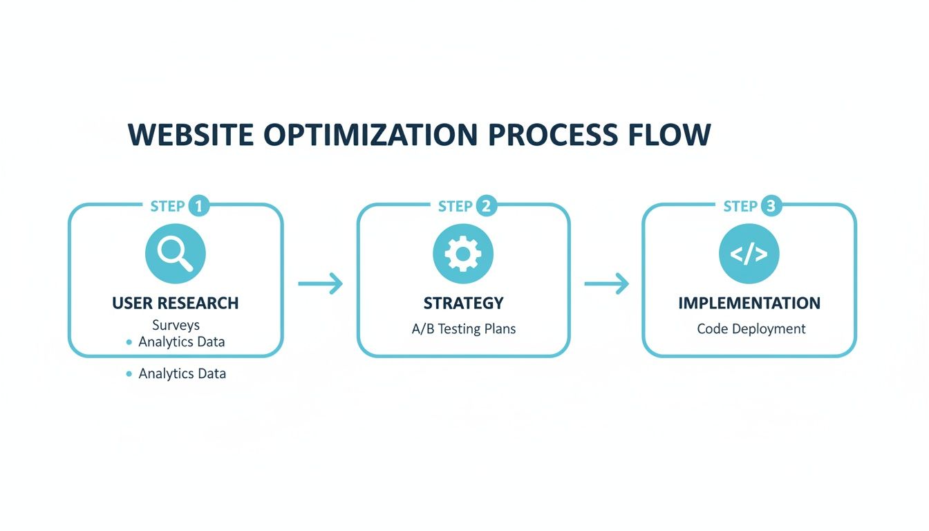
As you can see, successful optimization always starts with understanding the user—not just randomly tweaking buttons and colors.
Too many brands get stuck in a tactical rut, relying on basic countdown timers or generic email pop-ups. While these might capture a few emails, they rarely generate significant revenue and can even cheapen a brand's image. A truly sophisticated strategy is rooted in behavioral science.
It’s about deploying advanced psychological triggers like scarcity, social proof, and anticipation to create a sense of authentic urgency that feels natural, not forced.
A truly conversion-optimized website is built on a culture of continuous improvement. It’s a dynamic system that adapts to user behavior, market trends, and business goals through constant testing and refinement.
For Shopify Plus merchants, this means integrating sophisticated tools like Quikly with their existing marketing stack, including Klaviyo and SMS platforms. This allows you to create automated, cohesive campaigns that elevate the entire shopper journey. You can turn one-time promotions into predictable, revenue-generating "Moments" that also happen to be fantastic for managing inventory during high-demand sales periods, thereby protecting profit margins.
Every conversion journey starts with one thing: a smooth, intuitive user experience (UX). The psychology behind this is simple. When a website is easy to use, it reduces cognitive load—the mental energy someone has to spend just to figure things out. Lowering that effort makes the path to purchase feel natural and effortless, which is a direct line to boosting your revenue.
This is precisely why the best conversion-optimized websites are built on a user-centric foundation. To get there, you have to appreciate the critical role of user experience designers. Their entire job is to ensure every click and scroll—from the homepage to the final "buy" button—guides your customer seamlessly toward making a purchase.
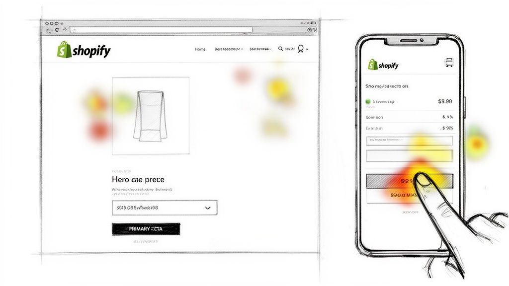
First, you need to find the hidden roadblocks that are making visitors leave your store. The industry average cart abandonment rate is a staggering 70%. That means for every 10 shoppers who add an item to their cart, 7 walk away. Even tiny points of friction can have a massive impact on your bottom line.
A solid UX audit is about hunting for these common conversion killers. Put yourself in the shoes of a first-time visitor and start analyzing your key pages.
Actionable Takeaway: Stop guessing what the problems are. Use tools like heatmaps and session recordings to see where users are clicking, getting confused, or giving up. This data gives you a clear roadmap for your optimization efforts. For Shopify stores, review your analytics to identify pages with high exit rates—these are your starting points.
The majority of e-commerce traffic now comes from mobile devices. This isn't a trend; it's the new standard. A mobile-first checkout is no longer a "nice-to-have"—it's an absolute must. A responsive design that just shrinks your desktop site doesn’t cut it. You need to design for the thumb.
This means big, tap-friendly buttons, simple forms that don't require a ton of typing, and a checkout process that feels linear and intuitive on a small screen. For Shopify store owners, this is your cue to pull out your phone and critically walk through your entire checkout flow, from cart to confirmation. To dive deeper, check out our guide on the best practices for web design.
Every extra step, every hard-to-read field, is another reason for a mobile shopper to abandon their cart. By prioritizing a frictionless mobile experience, you're meeting modern shoppers where they are and creating an environment where buying feels easy and secure.
An intuitive site design gets people in the door, but it's your words that convince them to stay and buy. This is where persuasive copy and compelling calls-to-action (CTAs) come into play—they are the real engines of conversion for any Shopify store.
This isn't just about listing product specs. It's about showing a customer how your product will solve their problem or help them achieve an aspiration.
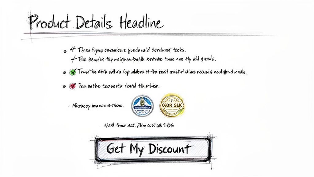
The best conversion optimized websites make one critical shift in their messaging: they talk about benefits, not just features. A feature is what your product does (e.g., "100% organic cotton"). A benefit is what the customer gets from that feature (e.g., "Experience unbelievable softness and breathable comfort all night long").
This simple tweak connects your product directly to a customer's desires, making the purchase feel essential.
Think of your headline as your one shot to grab a visitor's attention. If it doesn't immediately answer their unspoken question, "What's in it for me?"—you've likely lost them.
Frame every product description around solving a problem or making an aspiration a reality.
This approach taps into the real reasons people buy. Consumer psychology research consistently shows that decisions are driven by emotion first and justified by logic second. Your copy has to speak to both.
Your call-to-action button is arguably the single most important piece of copy on a product page. Many stores use generic, uninspired buttons like "Submit" or "Click Here." Those words create hesitation and kill momentum right when you need it most.
A powerful CTA needs to be specific, action-oriented, and psychologically tuned to nudge a customer into making a decision.
A great CTA clears up any confusion by making the next step completely obvious and desirable. Using possessive words like "My" or "Your" can even create a subtle sense of ownership before the purchase is even complete.
Instead of a passive "Add to Cart," test phrases like "Get My Discount Now" or "Reserve My Spot." This language creates a sense of immediate value and personal gain.
A single, focused CTA can work wonders. One case study from Willo showed they boosted conversions by 57% just by redesigning their homepage to feature one clear call-to-action. By stripping away distractions, they made the next step irresistible.
It's crucial to regularly audit and improve your own CTAs. You can learn more by exploring this guide on what makes a good CTA. Your goal should always be to move beyond basic buttons and craft language that truly motivates your audience.
When building a high-converting website, technical performance is the invisible engine driving everything. You can have the most beautiful design in the world, but if your site is slow to load, it’s all for nothing. Shopper patience is razor-thin, and your site’s speed is a direct reflection of how much you respect their time.
This isn’t just a hunch; it's a fact backed by data. Research shows that a page load delay of just 1 to 5 seconds can increase your bounce rate by a staggering 90%. When you realize the global e-commerce conversion rate already hovers between 2-4%, you can see why top Shopify merchants obsess over shaving off every possible millisecond.
For those on Shopify, hitting peak performance isn't about a magic bullet fix. It’s about a consistent, systematic approach—a series of small, continuous improvements that add up to a lightning-fast experience.
Here’s an actionable checklist to get you started:
Having a simple responsive layout is table stakes in today's world. True mobile optimization goes deeper. It’s about designing for the user’s actual context and how they physically interact with their device. The mission is to make browsing and buying feel completely effortless on a small screen.
Think "thumb-friendly." Can a user easily navigate your entire site, from the homepage to the final checkout button, using just one hand? If the answer is no, you've just found a major point of friction.
This means more than just stacking elements vertically. It means simplifying forms to cut down on typing, using big, tappable buttons, and making sure every interactive element feels snappy and responsive. For Shopify Plus merchants, in particular, a frictionless mobile checkout can be the difference between landing a high-value order and losing it to a competitor who got the experience right.
At the end of the day, a fast, genuinely mobile-optimized site directly translates to lower bounce rates and more revenue.
A slick user experience and compelling copy will get you most of the way there, but that final nudge often comes from tapping into the science of how people make decisions. This is where urgency marketing comes in, transforming your website from a passive digital storefront into an active sales environment.
This is not about slapping a generic countdown timer on your homepage. It's about ethically applying proven psychological principles from behavioral economics to give shoppers a compelling reason to buy now.
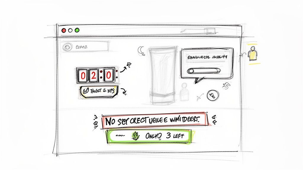
A simple timer creates pressure, but a sophisticated strategy builds genuine excitement and anticipation. That difference is what protects your brand’s reputation while driving revenue and protecting margins.
Effective urgency marketing leverages well-documented cognitive biases. When you understand these triggers, you can design campaigns that feel helpful and exciting, not manipulative.
By framing urgency as a value-add—an opportunity to get something exclusive or limited—you enhance the shopper's journey. This is the difference between forcing a decision and inspiring one. Quikly is the expert in this urgency marketing science, helping brands create powerful, revenue-generating campaigns.
Many Shopify stores lean on basic popups to capture emails or run simple discount timers. These tools are limited, often failing to generate significant revenue or protect profit margins. They are a passive tactic in an active environment.
A more sophisticated strategy involves creating automated, event-based campaigns—or "Moments"—that feel like a natural part of the shopping experience. For Shopify Plus merchants, this means connecting your urgency campaigns directly with your marketing stack, like Klaviyo and SMS platforms.
Here’s what that looks like in the real world for a Shopify Plus store:
This automated, multi-channel approach turns a simple promotion into a memorable brand event. It generates direct revenue, protects your margins by avoiding sitewide discounts, and strengthens customer loyalty. This is the next evolution of urgency marketing. See more ways to apply these principles in our guide to increase ecommerce conversion rates.
As you start digging into conversion optimization, questions are natural. Let’s tackle some of the most common ones.
Conversion optimization isn’t a one-and-done project; it’s a constant process of refinement.
If you’re running a high-traffic Shopify store, you should aim to have A/B tests running continuously. The more data you can gather, the faster you can make smart, iterative improvements.
For smaller stores with less traffic, focus on quality over quantity. Review your analytics and launch at least one significant, well-thought-out test each quarter. The real goal is to bake this into your culture. You want to be constantly improving based on data, not guesswork, especially on your most valuable pages like the homepage, product pages, and checkout.
Your overall conversion rate is the headliner, but it doesn't tell the full story. To see the true business impact of your efforts, you need to look at a few key metrics together.
It absolutely can if done wrong. When it’s built on fake scarcity or aggressive, obnoxious timers, it feels manipulative. Those tactics erode trust and cheapen your brand’s image.
But when you ground your urgency marketing in genuine psychological principles and authentic offers, it becomes a sophisticated tool that improves the customer experience. The key is to add real value. Create exciting, event-based "Moments" that build anticipation and reward loyal customers. This approach not only drives sales ethically but actually strengthens your brand perception.
You’ll see industry benchmarks floating around that cite an average e-commerce conversion rate between 2-3%. That number is almost useless on its own. It varies wildly depending on your industry, traffic source, and the price of what you're selling.
Chasing a universal number is a distraction. The only benchmark that truly matters is your own.
A "good" conversion rate is one that's consistently getting better month after month. Focus your energy on making small, steady gains through targeted optimizations. Conversion-optimized websites are built brick by brick with data-driven improvements, not overnight miracles.
Ready to go beyond basic timers and start running sophisticated, psychology-driven urgency campaigns? Quikly helps Shopify and Shopify Plus merchants create compelling moments that drive revenue, protect your margins, and get people genuinely excited about your brand.
Discover how you can leverage the science of urgency by visiting https://hello.quikly.com.

