High-Converting Shopify Banners: A Guide to Driving Revenue

Your Shopify banners are some of the most valuable digital real estate you own, yet many stores treat them like simple decorations. A banner's success isn't measured by aesthetics, but by its power to drive action and generate revenue. They are powerful tools grounded in consumer psychology, waiting to be optimized for maximum business impact.
Why Your Shopify Banners Aren't Converting
Many Shopify banners fail to pull their weight. Store owners perfect a design, only to have visitors scroll right past it. The classic mistake? Prioritizing aesthetics over the consumer psychology that compels a purchase.
The conversation must shift from, "Does it look good?" to "Does it create a measurable ROI?"
This means abandoning generic messages like "Free Shipping On All Orders." While a nice perk, it lacks the psychological trigger needed to drive a decision. It creates no urgency and doesn't signal exclusivity, doing little to combat the industry's staggering 70% average cart abandonment rate.
The Shift from Decoration to Revenue Driver
An effective banner strategy is directly tied to your bottom line, influencing not just conversion rates but also tangible outcomes like increasing Average Order Value (AOV) and protecting profit margins.
For example, instead of a basic sale announcement, a banner grounded in behavioral science can promote high-margin bundles or highlight a limited-stock item using the principle of scarcity. This is how you transform a passive browser into an active, high-value buyer and improve inventory management.

If you feel stuck in this cycle, it’s worth reviewing the bigger picture of conversion rate optimization best practices.
Mobile-First Mentality Is Non-Negotiable
This is critical. A banner that looks incredible on a desktop but is unreadable on a phone is a wasted opportunity and lost revenue.
The data is undeniable: Shopify sees approximately 79% of its traffic from mobile devices. The vast majority of your potential customers are viewing your store on a small screen.
Adopting a mobile-first approach isn't just a good idea; it's the foundation of any effective Shopify banner strategy. If your banner doesn’t work on mobile, it doesn’t work at all.
The Psychology Behind High-Impact Banners
The best Shopify banners aren't just visually appealing—they're engineered based on principles of behavioral economics. To move beyond guesswork, you must understand the psychological triggers that turn a passive browser into a paying customer. This isn't manipulation; it's about ethically leveraging fundamental human drivers to guide user behavior and increase revenue.
A generic "Sale On Now" banner is background noise. It's easily ignored because it carries zero psychological weight. But what about a banner that states, "Only 12 left in stock!"? That's different. It instantly activates loss aversion—the powerful principle from behavioral economics that humans are more motivated by the fear of losing something than the prospect of gaining it. That single line creates authentic urgency that a basic countdown timer can never replicate.
This is where clear design choices amplify those psychological triggers, ensuring your message lands with instant impact.

Actionable Takeaway: Visual clarity and direct, psychologically-informed messaging are non-negotiable. They are what make these tactics effective.
Advanced Behavioral Triggers vs. Basic Timers
Savvy shoppers can spot a fake countdown timer a mile away. These basic tactics often create a false sense of urgency that erodes trust. The science of modern urgency marketing lies in advanced, behavior-triggered banners that respond to what an individual shopper is actually doing on your site. This creates a far more personal, believable, and effective experience than a simple pop-up focused on email capture.
For instance, instead of a static "Limited Time Offer" banner, imagine a sophisticated system like Quikly's "Moments" that only shows a special offer after a user has viewed a specific product three times. This targeted approach feels exclusive and relevant, dramatically increasing its perceived value and driving revenue, not just leads.
Anticipation is another powerful psychological tool. Don't just announce a new product; orchestrate its launch with a sequence of banners.
- Phase 1 (Curiosity): "Something big is coming. Sign up for first access."
- Phase 2 (Exclusivity): "Our new collection drops in 48 hours. VIPs shop first."
- Phase 3 (Urgency): "It's here! Shop the new collection before it sells out."
This transforms a product drop into an anticipated event.
Psychology-Driven Banner Tactics
| Psychological Principle | Basic Tactic (Low Impact) | Advanced Strategy (High ROI) |
|---|---|---|
| Loss Aversion/Scarcity | Generic "Sale Ends Soon" timer | "Last chance! Only 3 of your size left in cart" |
| Social Proof | "Best Seller" tag | "Join 5,000+ customers who bought this week" |
| Anticipation | "New Arrivals" announcement | Multi-day banner sequence teasing a collection drop |
| Reciprocity | "Sign up for 10% off" popup | Offer a valuable free guide after a user reads a blog post |
The goal is to move beyond displaying a clock. By aligning your Shopify banners with proven principles like scarcity, social proof ("Over 10,000 sold!"), and anticipation, you create a compelling narrative that guides customers toward a purchase. This is the difference between gimmick and the science of urgency marketing.
Visuals are critical to amplifying the message. Explore the psychology of color for brands to learn how to influence purchasing decisions with your design choices.
Designing And Implementing Your Banner Strategy
A powerful banner concept is just the starting point. Turning that concept into a live, revenue-generating campaign requires a clear playbook that grabs attention without disrupting the user journey—especially on mobile.

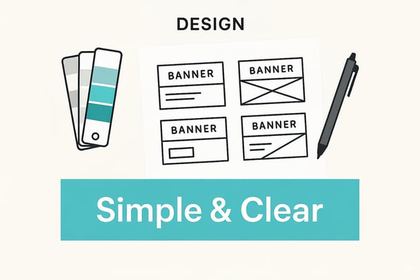
This begins with strong visual hierarchy. Your headline and call-to-action (CTA) must stand out immediately. Use contrasting colors, bold fonts, and sufficient white space to guide the eye precisely where you want it.
Writing Copy That Converts
Your banner copy is a direct sales pitch boiled down to its most potent form. Every word must earn its place.
- Headline: Scream value from the get-go. Use action-oriented language that strikes an emotional chord. "Unlock Exclusive Access" is far more compelling than a passive "New Collection Available."
- Call-to-Action (CTA): Be specific and irresistible. "Shop the Flash Sale" is superior to a generic "Learn More." It sets a clear expectation and urges the shopper to act now.
Actionable Takeaway: Review your current banner CTAs. Are they passive ("Learn More") or active ("Shop Now," "Claim Your Offer")? Making this one change can immediately lift performance. For more insights, review the fundamentals of effective content creation for small business success.
Shopify-Specific Implementation
Getting your banner live on Shopify can be handled in a few ways. For basic promotions, your theme’s built-in editor is often sufficient. Look for an "Image Banner" or "Slideshow" section to upload your design and add a link.
For more sophisticated, revenue-focused strategies, dedicated apps are essential. They move beyond static images to unlock powerful features:
- A/B Testing: Scientifically test different headlines, images, or offers to see what drives the most revenue.
- Audience Segmentation: Show one banner to new visitors and a different one to loyal, high-value returning customers. Shopify Plus merchants can leverage this for enterprise-level personalization.
- Dynamic Content: Display personalized offers based on user behavior, such as items viewed or cart contents.
A banner should not exist in a vacuum. The real ROI is unlocked when you integrate its message with platforms like Klaviyo or your SMS tool. A customer seeing a "Last Chance" banner should receive a matching email or text. This reinforces urgency and multiplies your campaign's financial impact. This is a key part of the strategic use of banners vs popups on Shopify and what separates a high-impact campaign from a simple website decoration.
Getting Your Banners Ready for Peak Shopping Events
During a massive traffic event like Black Friday, a single, static "Sale is Live!" banner is insufficient. To maximize ROI, you must think like a campaign manager, deploying a strategic sequence of banners that guides a shopper's psychology from curiosity to purchase.
This isn't just announcing a sale; it's about orchestrating the entire customer journey to build momentum and drive significant revenue.
Crafting a Multi-Stage Banner Campaign
Instead of a single banner, build a narrative sequence around your sale, using powerful psychological triggers like anticipation and scarcity to keep shoppers engaged from start to finish.
Here’s what that looks like in practice:
- The Teaser (Anticipation): 48-72 hours before the sale, use a banner like, "Black Friday Early Access Is Coming. Sign Up for First Dibs." This builds hype and a list of highly engaged buyers.
- The Launch (Urgency): When the sale goes live, present a clear, powerful offer: "Black Friday Is Here! 40% Off Ends Midnight." The message is direct, the deadline firm, and the urgency real.
- The Nudge (Scarcity): Mid-sale, introduce a flash sale on a specific high-margin product. A banner that states, "Flash Sale: The Next 3 Hours Only!" interrupts browsing patterns and drives impulse buys.
- The Final Push (Loss Aversion): In the last 12 hours, leverage loss aversion. Shoppers should feel they are about to miss out. A banner reading, "Going, Going... Gone! Sale Ends in 4 Hours" is far more compelling than a generic reminder.
This sequential strategy is essential for cutting through the noise. During the 2024 Black Friday Cyber Monday weekend, Shopify merchants generated a staggering $11.5 billion, with sales peaking at $4.6 million per minute. An optimized, psychology-driven banner strategy is your best tool for converting that traffic. You can explore more Shopify statistics and trends to understand the scale.
Actionable Takeaway: A sequential banner campaign does more than announce a deal—it crafts a psychological journey. By leveraging anticipation and scarcity, you can turn a high-traffic weekend into a record-breaking sales event while protecting profit margins with targeted offers instead of sitewide discounts.
Measuring Success Beyond the Click
A high click-through rate on your Shopify banners is a vanity metric if it doesn't translate to revenue. You are in business for profit, not clicks. To see the true financial impact, you must look beyond surface-level engagement and focus on the Key Performance Indicators (KPIs) that directly affect your bottom line.
This is how you turn your banner strategy from a guessing game into a reliable process for scaling your store. The goal is to attribute real dollars to your campaigns and prove their ROI.
What to Track (Besides Clicks)
To get a clear picture of your banners' performance, move past clicks and monitor these crucial metrics in your Shopify Analytics or Google Analytics dashboard.
- Banner-Influenced Conversion Rate: The ultimate test of persuasive power. What percentage of users who see or click a specific banner complete a purchase?
- Average Order Value (AOV): Are your banners promoting high-margin bundles or upsells working? A rising AOV is a clear sign you are increasing profitability per sale.
- Cart Abandonment Rate Reduction: When running urgency-based banners ("low stock," "last chance"), monitor this metric closely. A decrease directly translates to more recovered revenue.
A Simple Framework for A/B Testing
Continuous improvement requires testing. A simple A/B testing framework allows data, not intuition, to guide your strategy.
The key is to create two versions of a banner and test only one variable at a time—the headline, the offer, the color, etc.
Example:
Version A (Control): "Shop Our Summer Sale"
Version B (Variable): "Last Day for 30% Off Summer Styles"
Run this test for a set period (e.g., one week) and see which version drives a higher banner-influenced conversion rate and AOV. This simple process provides concrete, actionable insights to make every future campaign more profitable.
Answering Your Top Questions About Shopify Banners
When implementing Shopify banners, several practical questions arise. Getting these details right separates a banner that just looks nice from one that drives revenue.
What Is the Best Size for a Shopify Banner?
There's no single magic number, as the ideal dimensions depend on your Shopify theme. However, a solid starting point for a homepage hero banner is around 1800 pixels wide by 1000 pixels tall.
The most important rule is to think mobile-first. Always. With a majority of purchases happening on mobile, your banner must work on a small screen. Before publishing, preview your design on both desktop and mobile. Ensure text is legible and CTAs are easily tappable.
How Many Banners Should I Use on My Store?
Less is more. It’s tempting to announce every promotion at once, but this creates "banner blindness," a phenomenon where shoppers become so overwhelmed by competing messages that their brains ignore all of them.
Actionable Takeaway: Stick to one primary hero banner on your homepage for your main campaign. For sitewide announcements like a free shipping threshold, use a small, unobtrusive announcement bar at the top. The goal is clarity, not chaos.
Are Banners or Pop-Ups More Effective?
Smart marketers know this isn't an either/or decision—it's about orchestrating both channels to create multiple conversion opportunities throughout the customer journey. When strategically deployed together, banners and pop-ups create a powerful system for driving immediate action, not just passive email collection.
- Banners provide persistent visibility for time-sensitive offers, flash sales, and exclusive deals. They create awareness and urgency without disrupting browsing, priming customers for action while building anticipation for your most compelling promotions.
- Pop-ups are your conversion catalysts—perfectly timed interventions that transform interest into immediate action. Modern behavioral pop-ups go far beyond email capture, driving instant purchases through limited-time offers, exclusive access codes, and gamified experiences that create urgency and excitement.
The magic happens when you layer these touchpoints strategically. A banner might showcase your "48-Hour Flash Sale," building awareness as customers browse. Then, a behaviorally-triggered pop-up appears at the perfect moment—perhaps offering bonus rewards for purchases made in the next 10 minutes, or revealing an exclusive deal tier based on cart value. This multi-touch approach creates multiple "moments of yes" that convert browsers into buyers immediately.
By combining persistent banner messaging with precisely-timed pop-up interventions, you're not just capturing emails for future marketing—you're creating an urgency-driven experience that drives revenue right now.
Ready to turn your Shopify banners from static images into revenue-generating machines? Quikly moves beyond basic timers, using the science of urgency marketing to create high-impact campaigns that convert. See how our advanced behavioral triggers can drive immediate action and boost your sales.

The Quikly Content Team brings together urgency marketing experts, consumer psychologists, and data analysts who've helped power promotional campaigns since 2012. Drawing from our platform's 70M+ consumer interactions and thousands of successful campaigns, we share evidence-based insights that help brands create promotions that convert.
