
ecommerce psychology
brand loyalty
best brand experiences
A great ecommerce landing page isn't just another page on your site—it's a laser-focused environment engineered to achieve one specific business goal: turn visitors from a marketing campaign into paying customers. It works by stripping away all the usual distractions. No site navigation, no competing offers, just a straight line to a single, compelling call to action. This focused environment is the key to maximizing return on ad spend (ROAS) and driving profitable growth.
Before you even think about design templates or writing a single word of copy, you must lay the strategic groundwork. The most successful landing pages are built on a solid, profit-focused objective and a deep understanding of consumer psychology. This isn't just about making something look good; it's about creating a seamless journey from the ad click to the "thank you" page that feels both intuitive and incredibly persuasive.

This focused approach is exactly why these pages work so well. Research digging into over 464 million visits confirms that dedicated landing pages are the single most powerful conversion tool in your arsenal. The data is striking: they convert 160% better than traditional sign-up forms. Compare that to basic pop-ups, which struggle to get a mere 0.9% conversion rate. If you're curious, you can explore the full study about landing page performance. That massive difference in ROI drives home the importance of creating a focused experience.
To get there, you need to think through a few core components that connect your business goals with the customer's mindset.
Before diving into the design and build, every decision should be filtered through a strategic lens. We're talking about the "why" behind the page, not just the "what." This table breaks down the essential thinking that needs to happen first.
| Strategic Component | Business Focus | Customer Psychology Element |
|---|---|---|
| Singular Goal Definition | Establishing a clear, measurable business objective (e.g., clear inventory, launch a product, drive event sign-ups). | Focuses user attention, eliminates decision paralysis (Hick's Law), and provides a clear path to action. |
| Ad-to-Page Congruence ("Ad Scent") | Ensuring message consistency from the initial ad click to the final conversion to maximize ROI on ad spend. | Builds trust and reduces cognitive friction by delivering exactly what was promised in the ad. |
| Psychological Framework | Choosing a core behavioral trigger to shape the page's narrative and structure (e.g., scarcity, social proof, anticipation). | Taps into innate human motivations like FOMO, desire for status, or the need for a solution, making the offer more compelling. |
Each of these elements works together to create a cohesive, persuasive experience that feels natural to the shopper and delivers measurable results for your business.
Here’s a hard truth: a landing page that tries to do everything accomplishes nothing. Its power is in its singular focus. Is your goal to launch that new flagship product? Clear out last season's inventory before it kills your profit margins? Or are you trying to get sign-ups for an exclusive VIP event?
Each of these goals requires a completely different psychological hook.
Picking one primary objective is the anchor for every other decision you'll make, from the ad creative that gets them to the page in the first place to the final copy on your CTA button.
Actionable Takeaway: Before you do anything else, write down a single sentence that defines your page’s goal in terms of real business impact. Something like: "The goal of this page is to sell through the remaining 500 units of our summer collection in 72 hours to protect our profit margins and make room for new inventory." That clarity is your north star.
The customer's journey doesn't start on your landing page; it starts the moment they see your ad. "Ad scent" is the term for the connection between the promise you make in your ad and the reality of your landing page.
Imagine a user clicks an ad that screams "50% Off Flash Sale" but lands on a generic page with a vague "Shop Now" message. The scent is broken. This mismatch creates cognitive dissonance and friction, which is the fastest way to get someone to hit the back button—a particularly painful mistake for Shopify Plus merchants managing significant ad budgets.
To keep the ad scent strong, your landing page headline, main image, and core offer must directly mirror what was in the ad. This simple consistency reassures the user they made a good click and keeps them moving smoothly toward conversion.
The best landing pages don't just sell a product; they tap into the deep-seated motivations of the buyer. You have to go beyond listing features and benefits and get to the heart of why someone would buy.
Are your customers motivated by status? Are they looking for a practical solution to a daily frustration? Or do they want the thrill of being part of an exclusive club?
Once you understand these drivers, you can layer in psychological principles that speak directly to them. Instead of just slapping a generic countdown timer on the page, you can engineer an urgency-driven "Moment" with a platform like Quikly. This can build anticipation for a product drop or introduce real-time scarcity based on actual inventory levels. This transforms your page from a static digital brochure into a dynamic, event-like experience designed to convert, positioning your brand as a leader in creating exciting shopper journeys.
Once you've got your strategy locked in, it's time to start building. Think of a high-converting landing page less like a webpage and more like a finely tuned sales machine. It's not just a random collection of pretty pictures and text; it's a carefully crafted story where every single piece—from the headline down to the final click—has one job: to sell.
Each element has to flow into the next, guiding your visitor smoothly and inevitably toward that "buy now" button.
Nailing this anatomy is what separates the pros from the amateurs. It lets you break free from generic templates and build something that truly connects with your specific audience. You're blending persuasive copy, stunning visuals, and powerful psychological triggers that all work together to kill friction and spark desire.
If you want to see what this looks like in the wild, check out some of the best landing page designs for inspiration that are absolutely crushing it right now.
Your headline might be the only thing a visitor reads. It has to instantly answer their one burning question: "What's in it for me?" A killer headline connects your product's biggest benefit directly to your customer's biggest problem. No fluff.
It needs to be crystal clear, short, and a perfect match for the ad that brought them there. If the headline is weak, you've already lost. The subheading is its trusty sidekick, jumping in to quickly expand on that value or tease another key benefit.
People buy with their eyes. That means high-quality product photos and videos are completely non-negotiable. But don't just show the product; show it in a way that helps your visitor picture it in their own life. Context is everything.
Then there's the copy. Your words need to be obsessed with benefits, not just features. A feature is what your product is ("water-resistant coating"). A benefit is what your customer gets ("never worry about getting caught in the rain again"). That distinction is the secret to writing copy that hits on an emotional level.
When people are on the fence about buying, they look to see what others are doing. This is the psychological principle of social proof, and it's one of your most powerful tools for squashing hesitation. Weaving authentic social proof into your page is how you build instant credibility, especially for first-time visitors who don't know you yet.
This goes deeper than a simple star rating:
When a visitor sees that people just like them are already using and loving your product, their perceived risk plummets. This is often the final nudge they need to pull the trigger.
Every single element on your landing page should funnel the visitor to one spot: the call-to-action button. Your CTA needs to be visually prominent. Use a color that contrasts with the rest of the page so it's impossible to ignore.
The words on the button matter, too. Ditch boring, generic phrases like "Submit" or "Click Here." Get specific and use action-oriented language that reminds them of the value they're getting. Something like "Get Your 50% Off Now" or "Claim My Exclusive Offer" works way better.
The goal here is zero friction and zero confusion. The next step should feel like the most obvious, easy choice in the world. Anything else on the page that might distract from this one single action—like a navigation menu or links to other products—is just diluting the page's power and killing your ROI.
A well-designed landing page might pique a visitor's interest, but smart psychology convinces them to act right now. This goes way beyond just slapping a basic countdown timer on the page, which often feels generic and adds pressure instead of genuine excitement. The most effective landing pages for ecommerce are built on a solid understanding of behavioral economics, transforming a static sales page into a dynamic, revenue-driving event.
The real goal here is to tap into what fundamentally motivates people. Principles like scarcity (something is in limited supply), FOMO (the fear of missing out), and anticipation aren't manipulative tricks; they’re powerful behavioral triggers that communicate an offer's value and push for a decision. When a shopper feels like a deal is exclusive or won't last long, their brain kicks into high gear. This dramatically cuts down on cart abandonment—a massive headache that plagues nearly 70% of all online shopping carts.
Standard countdown timers and generic pop-ups have their limits. They usually have one simple goal, like email capture, and lack the finesse to drive high-value sales. This one-size-fits-all approach can come off as inauthentic and, over time, can even devalue your brand. They simply can't match the sophistication of behavioral triggers.
Advanced urgency marketing is different. It’s about creating specific "Moments" of excitement that feel tailor-made for the customer. Instead of a bland "sale ends in 24 hours" banner, a more sophisticated strategy could look like this:
This kind of thinking transforms urgency from a blunt instrument into a precision tool. It protects your profit margins by avoiding deep, site-wide discounts and directly ties your marketing efforts to a clear return on investment. Quikly is the expert in this urgency marketing science, enhancing banners, popups, and the entire shopper journey with these sophisticated psychological triggers.
A powerful urgency strategy isn’t about making customers feel rushed. It's about making them feel like they're part of a unique, can't-miss opportunity. That mental shift is key to building brand loyalty while generating immediate revenue.
Picture this: you're a Shopify Plus merchant about to launch a limited-edition sneaker. The standard approach? A landing page with product photos, a description, and an "Add to Cart" button. It works, but it's uninspired.
Now, let's inject some advanced urgency psychology into the mix.
That landing page is no longer just a page; it’s the hub for the entire launch "Moment." Weeks before the drop, you start sending traffic there. Visitors can't buy anything yet, but they can sign up to "get in line." You're building a valuable list of high-intent leads that you can then warm up with Klaviyo email flows and SMS alerts, creating a groundswell of anticipation.
Then, on launch day, the page comes alive.
You've just turned a simple product drop into an engaging, competitive event. Not only do you sell out faster, but you also collect valuable customer data and create a brand experience people will remember. This automated, sophisticated use of psychology is what separates a landing page that just sits there from one that actively grows your business and protects your inventory.
If you're on Shopify or Shopify Plus, you don't need a clunky, expensive page-builder app to create a landing page that converts. The native power of Shopify's Online Store 2.0 editor has everything you need to build a focused, revenue-driving experience from the ground up.
The trick is to think beyond the standard page and product templates everyone else uses. You're creating an isolated environment, one that's completely free of distractions. That means no main navigation, no footer, and zero links pulling visitors away from the one single action you need them to take.
First, you need a new, custom page template. It's simpler than it sounds. Inside the Shopify theme editor, you can create a new template based on your default page. Once that's done, you can hide the header and footer sections for that specific template. It’s one of the simplest and most powerful changes you can make, instantly forcing all attention onto your offer.
This custom template is now your blank canvas. From here, you can use Shopify’s drag-and-drop sections—like image banners, rich text, and custom liquid—to build out your landing page piece by piece. The beauty of this approach is that your page will be lightning-fast because it’s built on native Shopify architecture, not bogged down by third-party code.
More than half of all ecommerce traffic now comes from a phone. A mobile-first design isn't just a good idea; it's absolutely essential if you want to be profitable. As you’re building with Shopify’s sections, constantly toggle to the mobile view.
Page speed is the other silent conversion killer. Sticking to native Shopify sections and optimizing your images helps you build a page that loads almost instantly, which keeps both your visitors and Google's mobile-first indexing happy.
Pro Tip for Shopify Plus Merchants: If you’re planning a high-traffic product drop or a flash sale, building natively in Shopify is mission-critical. It ensures your page can handle a massive, sudden surge of traffic without crashing. You protect your revenue and your brand’s reputation when it matters most.
A static page is good, but a dynamic page that communicates with the rest of your tech stack is what generates revenue. This is where you connect your page to powerful tools to create a campaign that works across multiple channels.
This flow gives you a sense of how different psychological triggers can be layered into a campaign that all points back to your landing page.
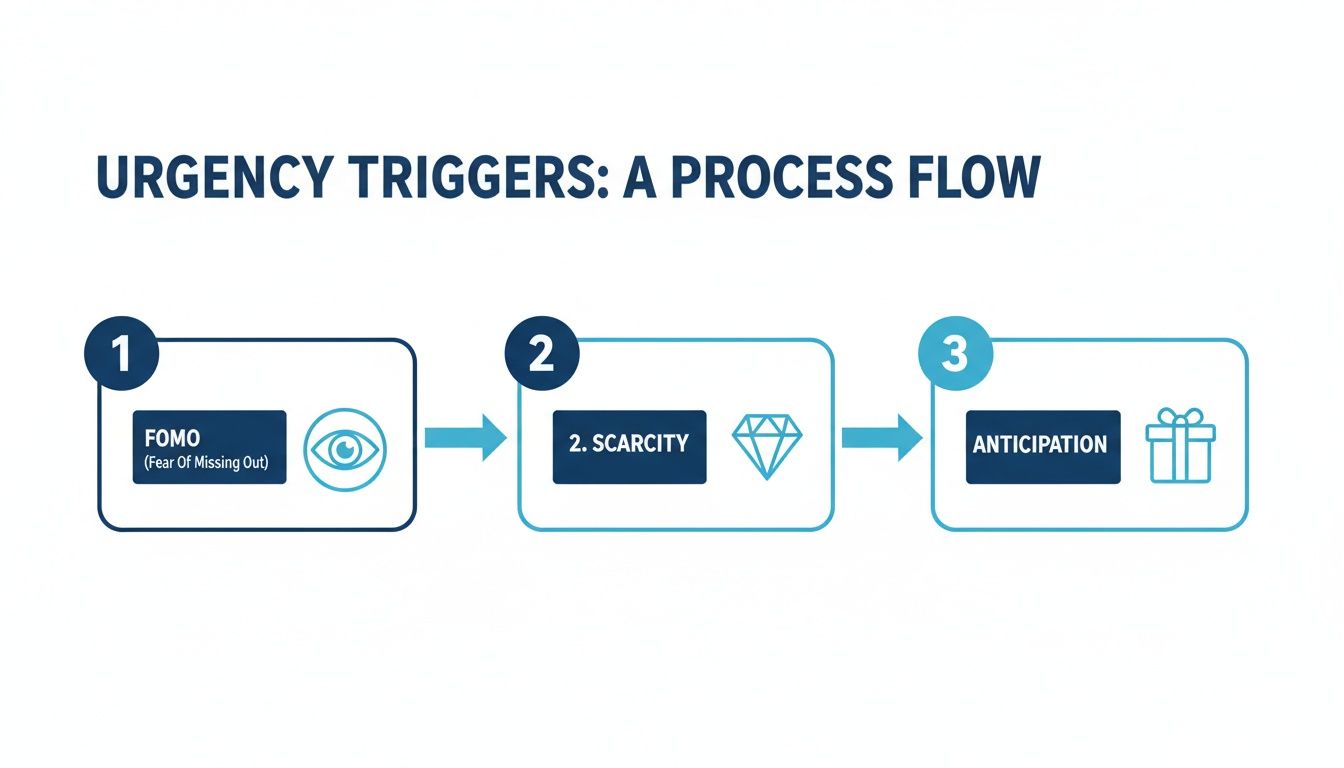
Each of these triggers—FOMO, Scarcity, and Anticipation—plays a specific role in nudging the customer from just being curious to actually making a purchase.
Adding something like a Quikly urgency snippet is straightforward. In your new template, just add a custom HTML or liquid section and paste in the code. This lets you seamlessly embed dynamic elements like a real-time leaderboard or a live inventory counter right on your page. It’s a much smarter play than relying on generic popups for Shopify, which tend to just interrupt the user journey.
Finally, connect your landing page form to your marketing platforms, whether that's Klaviyo or your SMS provider. When someone signs up for early access, that action needs to automatically kick off a pre-built email or text flow. This is how you nurture those leads, build anticipation, and make sure you have a warmed-up, engaged audience ready to buy the second your offer is live.
Launching your landing page isn't the finish line; it’s the starting block. Real, sustainable revenue growth comes from a relentless commitment to data-driven optimization. This isn't about guesswork or following the latest design trends. It's about creating a scientific feedback loop where every visitor interaction gives you the insights needed to make your next campaign more profitable.
Building a page is one thing, but turning it into a fine-tuned conversion machine requires a different mindset altogether. The goal is to move beyond assumptions and make decisions based on what your customers actually do.
The foundation of optimization is A/B testing—the simple practice of comparing two versions of your page to see which one performs better. You can get this going with tools like Google Optimize or one of the many native apps within the Shopify ecosystem. The key is to test one significant element at a time. If you change the headline and the button color, you'll have no idea which change actually caused the result.
I always recommend starting with your highest-impact elements first:
A disciplined approach to testing is absolutely essential. For a deeper dive, you can explore in-depth conversion rate optimization best practices that cover different testing methodologies and strategies.
While conversion rate is a vital metric, it doesn't tell the whole story. An obsession with conversion rate alone can lead you down a dangerous path of running deep-discount offers that attract customers but completely destroy your profit margins. To get a true picture of your landing page's business impact, you have to look at more advanced Key Performance Indicators (KPIs).
The most profitable ecommerce brands don’t just ask, "Did they convert?" They ask, "How much revenue did each visitor generate?" This shift in focus is critical for scaling campaigns profitably.
Focus on these three revenue-centric KPIs:
The e-commerce conversion rate landscape has shifted significantly. While the global average hovers around a modest 1.9%, Shopify stores often do a bit better at 2.5-3%. But the top-tier landing pages? They blow these numbers away. The top 25% of performers are achieving conversion rates of 11.4% or higher. It's also critical to note that desktop conversions (3.9%) still substantially outperform mobile (1.8%), underscoring the need for device-specific optimization.
Numbers tell you what is happening, but user behavior tools tell you why. Tools that provide heatmaps and session recordings are like having a window directly into your user's mind.
Beyond the initial setup, you have to keep optimizing. You can explore more advanced strategies to improve ecommerce conversion rates, including the use of AI for better visual engagement. By combining quantitative data (like RPV) with qualitative insights (like session recordings), you create a powerful, iterative cycle. You identify a problem, form a hypothesis, test a solution, and measure the impact directly on your bottom line.
Even with the best strategy in place, you're bound to run into some specific questions when you're in the weeds building and optimizing landing pages. Let's tackle some of the most common ones from ecommerce brands.
A product detail page (PDP) is a permanent part of your website's catalog, complete with main navigation, footers, and links to other categories. Its job is to provide comprehensive details on an item within a broader shopping journey.
A landing page, however, is a standalone page built for a single marketing campaign with one goal. We intentionally strip away everything else—no navigation, no links to other products, just a laser-focused message and a single, unmissable call-to-action. This intense focus is exactly why they outperform PDPs for converting paid campaign traffic and maximizing ROI.
This is a great question because nobody likes feeling manipulated. The key is to ground your urgency in real consumer psychology, not just a generic countdown timer. Instead of manufacturing pressure, create a genuine, event-based "Moment" that builds excitement. You're not just selling; you're creating an exclusive opportunity based on behavioral science.
This is a simple reframe that makes a world of difference:
This sophisticated psychological approach actually adds value to your brand. Customers feel like they’re part of a unique event, and they act because of real anticipation, not because of some pushy sales tactic.
While there are many page builder apps, you can build incredibly effective landing pages using Shopify's built-in Online Store 2.0 editor. For keeping page speeds lightning-fast—which is critical for conversions—it’s often the better way to go.
All you have to do is create a new, custom page template and you can easily hide the standard header and footer. From there, you just use Shopify's native sections to drag-and-drop a focused layout without touching a line of code.
If you want to add more advanced features, like a sophisticated urgency campaign, you can integrate a specialized tool like Quikly directly into your native Shopify page. That gives you the best of both worlds: the speed of a native build with the power of a dedicated behavioral marketing tool.
Conversion Rate is the obvious one, but the smartest brands look deeper. An offer that converts like crazy but tanks your profit margins isn't a win—it's a liability.
Your goal isn’t just to get a conversion; it's to acquire a profitable customer. That means you have to look past the surface-level vanity metrics and focus on the real financial impact of your campaign.
Make these your North Star KPIs:
Transform your landing pages from static displays into high-conversion events. With Quikly, you can build dynamic, psychology-driven campaigns that create real urgency and drive immediate revenue.

