Urgency Marketing
ecommerce psychology
popups for shopify
When you're trying to increase your ecommerce conversion rate, it's easy to get tunnel-vision on that one specific number. But the real win isn't just a higher percentage—it's what that percentage represents: a healthier, more profitable business. We're talking about boosting revenue, protecting your margins, and moving inventory faster. That’s where the magic really happens.
Obsessing over a conversion rate in a vacuum is like watching your car's RPMs instead of the speedometer. It’s an important metric, but it’s not the destination. The actual goal is tangible business growth. This is why Conversion Rate Optimization (CRO) shouldn't be treated as just another marketing task; it's a core revenue-driving activity.
A higher conversion rate means your business runs more efficiently. Simple as that. Every dollar you put into advertising suddenly works harder, which drives up your Return on Ad Spend (ROAS) and pushes down your customer acquisition costs. Instead of needing to pump more money into ads just to maintain sales, you start generating more sales from the traffic you already have. This is how you protect profit margins and build a foundation for sustainable growth.
Before you start making changes, you have to know where you stand. The average global ecommerce conversion rate floats around 1.9%, but that number can be misleading. On a platform like Shopify, for instance, the average is a bit higher, typically between 2.5% and 3%.
If your store is hitting over 3%, you’re already doing pretty well. The truly optimized stores, often on Shopify Plus, are often seeing 4-5% or even more. Things like site speed, brand reputation, and dedicated CRO work make a huge difference.
This chart really drives home the difference between the bottom, the middle, and the top.
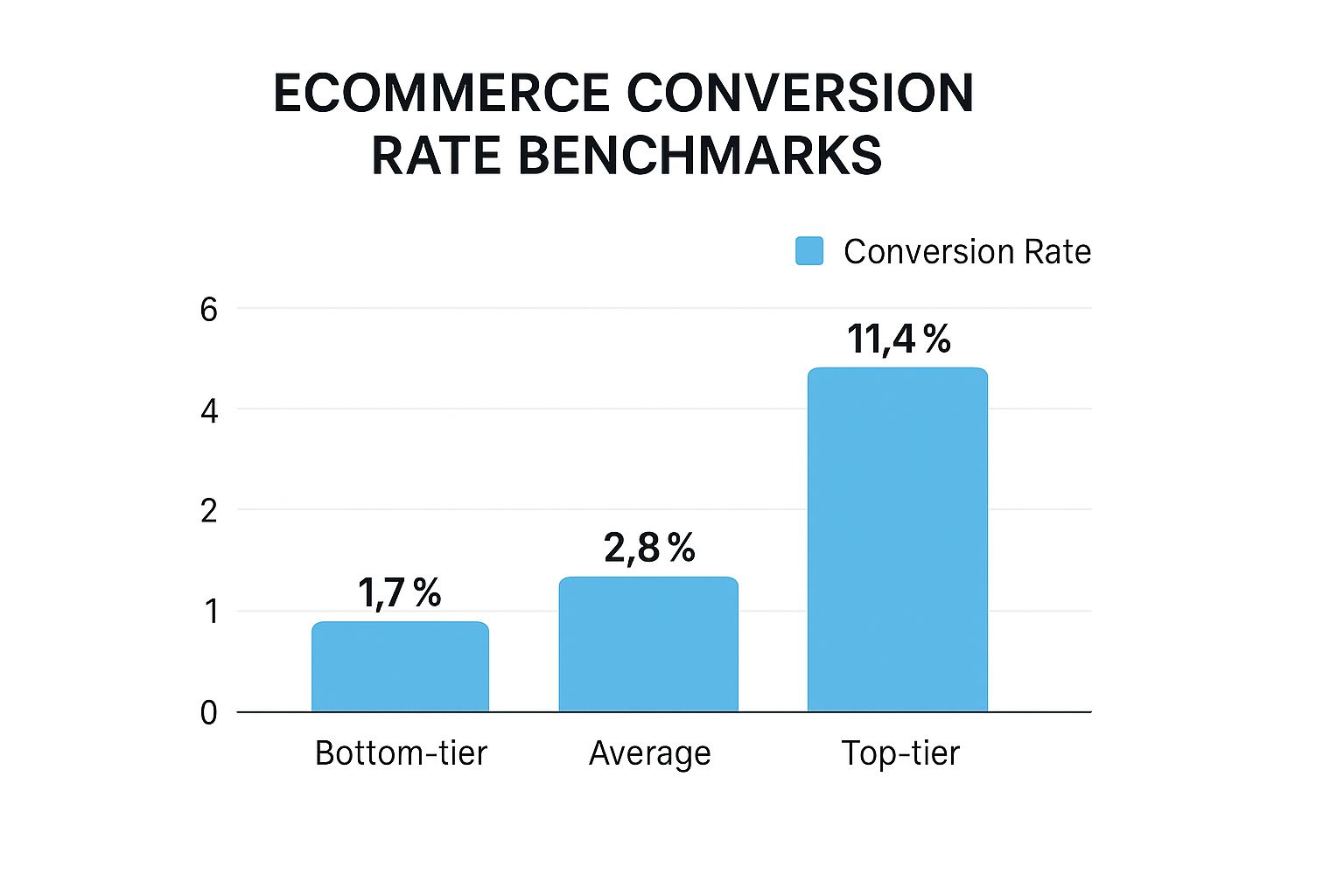
As you can see, the gap is massive. The top performers aren't just a little better; they're often converting 3-4 times higher than the average store. They're playing a different game entirely.
To give you a clearer picture of where you might fit, it helps to look at benchmarks broken down by industry. What’s considered “good” in fashion might be completely different from what’s expected in electronics.
A comparative look at average conversion rates across different ecommerce sectors to help you set realistic goals.
Industry | Average Conversion Rate (%) | Key Consumer Behavior |
|---|---|---|
Fashion & Apparel | 1.0% - 2.5% | High browsing, comparison shopping, impulse buys |
Health & Beauty | 2.5% - 3.5% | Brand loyalty, repeat purchases, trust-driven |
Electronics | 1.0% - 1.8% | Research-heavy, price-sensitive, long consideration |
Food & Beverage | 3.5% - 5.0% | Subscription models, high repeat purchase rate |
Home & Garden | 1.5% - 2.8% | Project-based, seasonal demand, visual-driven |
These figures show just how much consumer intent can vary. A customer buying a new skincare product they trust is a much quicker "yes" than someone comparing specs on a $1,500 laptop. Use these as a guidepost, not gospel.
A lot of stores get stuck in the tactical weeds. They throw up a generic "10% off" email pop-up or add a simple countdown timer and call it a day. While these might snag a few email addresses, they rarely move the needle on revenue and, frankly, can just annoy potential customers.
The most successful brands I've worked with get that powerful CRO is built on behavioral economics and consumer psychology. It’s about creating genuine urgency and authentic excitement, not faking scarcity.
This is how top-tier stores get those incredible results. They move past the gimmicks and embrace sophisticated, trigger-based marketing that responds to what a user is actually doing. Instead of a one-size-fits-all pop-up focused on email capture, they'll show a personalized offer based on browsing history to drive immediate revenue. Instead of a generic timer, they'll build real anticipation around a limited-edition product drop.
This strategic approach plugs directly into your most important business goals:
Revenue Growth: Turning more browsers into buyers, every single time.
Inventory Management: Clearing out seasonal stock without having to slash prices and kill your margins.
Profit Protection: Increasing your sales volume without giving away the farm.
Getting this right means you need to truly understand what makes your specific customers tick. For a deeper dive into practical strategies to improve ecommerce conversion rates, it's incredibly valuable to see how different tools can be put to work. When you focus on the science behind the sale, you can build a system that consistently improves performance and delivers a real, measurable financial impact.
There's a reason urgency works so well: it taps directly into core human psychology. Nobody wants to miss out. This is rooted in loss aversion—a powerful motivator discovered by psychologists Kahneman and Tversky. Simply put, the fear of losing something feels more intense than the pleasure of gaining it. When a shopper sees that a product they want has low availability, that fear of missing out (FOMO) kicks in, and they act fast to avoid the regret of it selling out. The key is to make it feel genuine and helpful, not pushy or fake.
One of the most authentic ways to create urgency is by showing real, live inventory counts. It’s transparent, honest, and incredibly effective.
For example, if you're on Shopify, you can use an app like Quikly to automatically sync your inventory levels and display them on your product pages.
Actionable Takeaway: Instead of a generic message, use dynamic labels like “Only 3 left in stock!” to create a real sense of immediacy.
You could even trigger a small, limited-time offer automatically when a product’s inventory drops below a certain number.
Pair these low-stock alerts with one-click payment options like Shop Pay or Google Pay to make it ridiculously easy for customers to complete their purchase on the spot.
People trust other people. The psychological principle of social proof suggests that when a potential buyer sees that others are purchasing a product, it instantly reduces their own anxiety about making the wrong choice. It’s the digital equivalent of seeing a busy restaurant—you just assume the food must be good.
Here are a few ways this can be implemented:
Actionable Takeaway: Display a live feed of recent purchases to show that products are popular and in demand.
Use a tool like Klaviyo to send a follow-up email to someone who viewed a trending item, letting them know it’s selling fast. This can be easily integrated with your Shopify store data.
For visitors who keep coming back to the same product, a timely SMS alert can be the final nudge they need.
The principle of anticipation can be just as powerful as the launch itself. It’s all about building excitement and making your customers feel like insiders.
Think about dropping subtle hints and building suspense:
Actionable Takeaway: Add teaser banners to your homepage and relevant category pages a week before the launch.
Give your loyal customers early access. A simple email or SMS to your VIP list offering a 24-hour head start can work wonders for loyalty.
Countdown timers and sneak-peek videos are classic for a reason—they build that can't-wait feeling.
We've all seen those generic countdown timers that just start ticking the second you land on a page. They often feel fake and can even cheapen your brand. This is where urgency marketing science offers a more sophisticated approach than basic pop-ups or timers.
A smarter approach is to use behavior-triggered urgency. This is where a platform like Quikly really shines. Instead of a one-size-fits-all timer, you can set up "Moments" that activate based on what the shopper is actually doing.
Feature | Basic Countdown Timer | Behavior-Triggered "Moments" |
|---|---|---|
Activation | Triggers immediately on page load. | Activates based on user actions (e.g., scroll depth, time on page, repeat visits). |
Relevance | Low. Often ignored by unengaged visitors. | High. Appears when the shopper is most engaged, feeling relevant and helpful. |
Business Impact | Can feel gimmicky, hurting trust and brand perception. | Feels helpful and personalized, boosting revenue and protecting brand integrity. |
Imagine a special offer that only appears after a customer has scrolled past the product details and is looking at the reviews. That’s a moment of high intent, and it’s the perfect time to present a compelling reason to buy now. This isn't about tricking someone; it's about timing your offer for maximum impact.
How you word your offer is just as important as the offer itself. You need to create urgency without giving away the farm. The goal is to drive action while protecting your profit margins.
Here are a few examples of well-framed offers:
Flash Sale: “Midnight Drop: 20% off our new collection for the next 4 hours only.”
Exclusive Access: “VIP Preview: Shop our new arrivals 24 hours before everyone else.”
Inventory-Based: “Low-Stock Alert: The last five units are 10% off. Get yours before they’re gone!”
Actionable Takeaway: Don't be afraid to A/B test your messaging. I’ve seen small tweaks to wording lift conversion rates by 10-15%. It's all about finding what resonates with your specific audience.
Urgency marketing gets a bad rap when it's built on lies. Never, ever use fake scarcity. Customers are smart, and they will see right through it. If you say there are only five items left, there had better be only five items left.
Trust is your most valuable asset. Protect it by being transparent and ensuring all your timers, stock counts, and offers are 100% real.
For a deeper dive, check out this guide on 10 advanced urgency marketing tactics for more ideas.
The beauty of this approach is that it combines proven psychology with smart automation. You're not just hoping for one-off sales spikes; you're building a sustainable system for converting more visitors into loyal customers.
Think of your product and category pages as your digital sales floor. In a physical store, everything from the lighting to the layout is designed to guide customers and make them feel good about their purchase. Your website needs to do the exact same thing. Every single element has to work together to remove any hesitation and build instant trust.
This all starts with what your customers see first: your product visuals. They can't touch or feel the product, so your images and videos have to do all the heavy lifting. A single, blurry photo can make your whole brand feel unprofessional and kill a sale before it even has a chance.
High-quality photography isn't a "nice-to-have"—it's a must. Shoppers expect to see your products from every conceivable angle, in different real-world settings, and with a zoom feature to get a closer look. Videos take it a step further by showing the product in action, which is something a static image just can't replicate.
Show, Don't Just Tell: Use lifestyle shots so customers can imagine the product in their own lives. If you sell clothes, show them on different body types. If you sell furniture, place it in a beautifully styled room.
Zoom in on What Matters: Use close-ups and even annotations to highlight the specific details that set your product apart.
Get Creative Without Breaking the Bank: If professional photoshoots are a budget-strainer, don't worry. You can explore AI stock photo alternatives to find unique, high-quality imagery that fits your brand.
Once you’ve nailed the visuals, your product descriptions need to seal the deal. Ditch the boring, feature-only lists. Instead of just saying "100% organic cotton," try something like, "Feel the incredible softness of our ethically sourced organic cotton." You're not just selling a t-shirt; you're selling comfort and a good conscience.
Uncertainty is the ultimate conversion killer. Shoppers will hesitate if they can't easily find answers to basic questions about shipping costs, delivery times, or your return policy. Don't make them hunt for this information in a footer link; put it right there on the product page where they can't miss it.
Actionable Takeaway (Shopify): This is easy to do with a few theme customizations or by using apps that add trust-building sections right under the "Add to Cart" button. Clearly stating "Free 3-day shipping on orders over $50" or "Easy 30-day returns" handles major objections before they even pop into a customer's head.
The principle of social proof is a powerful psychological trigger. It basically means people are more likely to do something if they see others doing it. For your store, customer reviews are the most potent form of social proof you have.
Seeing those five-star ratings from real people gives new shoppers the confidence they need to click "buy." Make it a habit to ask for reviews. You can set up an automated email through a tool like Klaviyo to send a friendly follow-up a week or so after an order is delivered.
Even better? Showcase photos from actual customers using your products. This user-generated content (UGC) feels authentic and builds a level of trust that polished brand photos sometimes can't.
Ultimately, your goal is a smooth, frictionless path from the moment someone lands on your page to the moment they add an item to their cart. By anticipating customer questions and solving them with great visuals, benefit-driven copy, and clear, transparent policies, you can systematically increase your ecommerce conversion rate. You’ll build a storefront that doesn’t just show off products—it sells them.

It’s a painful reality of e-commerce: the industry average for cart abandonment hovers near a staggering 70%. Think about that. Seven out of every ten shoppers who add a product to their cart leave without buying. This isn't just a transactional step; it’s the final, and often toughest, hurdle in their journey.
This is where your most valuable, high-intent buyers get tripped up. A confusing, slow, or untrustworthy checkout process is a direct drain on your revenue. Each abandoned cart represents not only a lost sale but also wasted ad spend. The good news? Fixing it offers one of the biggest returns you can get. Making the process faster, simpler, and more secure lets you reclaim that lost revenue and gives your ecommerce conversion rate a serious boost.
Let's be clear: your checkout must be designed for mobile. We're well past the point where desktop is the default. Today, over three-quarters of e-commerce visits happen on smartphones, driving nearly two-thirds of all online orders. You can dig into the data in this comprehensive Statista report.
This means every single element—from the size of your buttons to the layout of your forms—has to be built for the mobile experience first.
Big, Tappable Buttons: Make sure CTAs and form fields are easy to hit with a thumb. No one wants to pinch-and-zoom just to check out.
A Clean, Focused Layout: Strip away all distractions. The checkout is not the place for navigation menus, promotional banners, or social media links.
Effortless Vertical Flow: The entire process should be a simple scroll down. If a user has to pan horizontally, you've already introduced unnecessary friction.
For anyone on Shopify, this might mean choosing a theme built for mobile checkout. If you're on Shopify Plus, you have the power to customize the checkout.liquid file to create a completely branded, streamlined experience that feels like a natural extension of your store.
Every single field you ask a customer to fill out is a reason for them to give up. It’s a psychological principle called cognitive load—the more information you force someone to process, the more likely they are to abandon the task. Your goal is to make it feel effortless.
Actionable Takeaway: Take a hard look at your checkout form. Do you really need their phone number? Can you combine "First Name" and "Last Name" into a single "Full Name" field? Can the billing address default to the shipping address with a simple checkbox? Each field you eliminate is a small win that adds up to a much higher completion rate.
The fastest and easiest checkout will always win. If a customer can complete their purchase in 15 seconds with an express wallet versus three minutes of manual entry, you've made the decision for them.
The single most effective way to simplify the checkout is to let customers skip the forms entirely. This is where express payment options like Shop Pay, PayPal, and Google Pay come in. They securely store a customer’s shipping and payment details, letting them check out with a single tap.
This isn't just a nice-to-have anymore; it's what shoppers expect. Seeing these familiar logos builds instant trust and removes the biggest point of friction, especially on a small screen. Enabling them in your Shopify settings is one of the quickest wins you can get.
Right as customers are about to pull out their credit card, their sensitivity to security is at its absolute peak. Any little thing that looks unprofessional or insecure can trigger last-minute doubt and send them running.
This is the time to go all-in on reinforcing their confidence.
Show Off Your Security: Display recognizable trust badges. Think SSL certificates (like McAfee or Norton) and the logos of accepted payment methods (Visa, Mastercard, Amex).
Be Reachable: Make sure your customer service email or phone number is clearly visible. It shows you're a real business that stands behind its sales.
Look the Part: The checkout page must have the same professional look and feel as the rest of your site. Any disconnect in branding can feel jarring and untrustworthy.
By combining a frictionless, mobile-first design with powerful trust signals, you can transform your checkout from a conversion killer into a revenue-generating machine.
Getting your conversion rate up isn't a "set it and forget it" task. The brands that consistently win are the ones that build a culture around constant learning and tweaking. They don't guess what their customers want—they test, measure, and then test again. This is how small, steady improvements snowball into major, long-term revenue.
Think about it: a static, one-size-fits-all website is a relic of the past. It treats every visitor the same. But a first-timer who just clicked an Instagram ad is in a completely different headspace than a loyal customer who's bought from you five times. Personalization is all about recognizing that difference and shaping the shopping experience to feel like you get them.
And this goes way beyond just sticking someone's first name in an email. Real personalization digs into the data to serve up smarter, more relevant offers that actually make sense for that specific shopper.
A/B testing (or split testing) is your best friend when it comes to data-driven optimization. It’s pretty simple in concept: you create two versions of something on your site—a headline, a button, a product image—and show each version to a different group of visitors to see which one gets better results. Without this, you're just throwing ideas at the wall and hoping something sticks, which is no way to grow a business.
To make it work, you need a structured plan that focuses on high-impact areas first.
Headlines & Value Props: How are you communicating your product's core benefit? Pit different angles against each other. Does “Durable & Long-Lasting” resonate more than “Built for a Lifetime of Adventure”? Only a test will tell you for sure.
Calls-to-Action (CTAs): Don't underestimate the power of a button. Test the text, color, and even the placement of your "Add to Cart" or "Buy Now" CTAs. I’ve seen a simple change from "Purchase" to "Get Yours Now" make a surprising impact.
Promotional Offers: What kind of deal actually motivates your audience? Is it a straight 20% Off discount, or does "Free Shipping" get more people across the finish line? Test them head-to-head.
If you’re on Shopify, you can get started pretty easily with tools like Google Optimize or one of the many A/B testing apps in the Shopify App Store. The golden rule is to test one thing at a time. That's the only way you can be certain what change actually caused the lift in performance.
Once you're comfortable testing individual elements, the next level is personalizing the entire shopping journey. This is where you start showing different content and offers to different groups of customers based on what they do on your site.
A shopper who has viewed the same pair of shoes three times this week is practically raising their hand and shouting, "I'm interested!" Blasting them with a generic, site-wide promo is a huge missed opportunity. A targeted email about that specific pair of shoes is infinitely more powerful.
This is where your email and SMS platforms become your secret weapons.
Browsing Behavior: Use a platform like Klaviyo to tag customers based on the products and collections they look at. You can then trigger automated email flows that remind them of those exact items, maybe adding in some customer reviews or related products to seal the deal.
Purchase History: Group your customers into meaningful segments like "first-time buyers," "VIPs" (your big spenders), or "lapsed customers." A "we miss you" discount sent to someone who hasn't bought in six months feels personal and can be just the nudge they need to come back.
Cart Contents: If a customer adds a high-value item to their cart, you can use an SMS tool like Attentive to trigger a personalized text offering free shipping to push them over the edge. It's immediate, personal, and highly effective.
For larger brands on Shopify Plus, the personalization game gets even more interesting. You can use Shopify Scripts to run custom code right at the checkout, creating hyper-specific experiences that just aren't possible otherwise.
This is where you move from simple A/B tests to truly dynamic customization. For example, a script could automatically apply a "buy one, get one 50% off" deal but only for customers with a "VIP" tag. Or it could unlock exclusive shipping options once a cart hits a certain dollar value. This gives you surgical control to remove friction for your best customers right when it matters most, directly helping to increase your ecommerce conversion rate.
Ultimately, you want to create a feedback loop. The data from your A/B tests should inform your personalization strategy, and the results of that personalization will spark new ideas for what to test next. It's a never-ending cycle of improvement that keeps your store evolving right alongside your customers' behavior.
When you're trying to improve your store's performance, a lot of questions come up. It's totally normal. Below, I’ve broken down some of the most common things merchants ask, with straightforward answers to help you get unstuck and start seeing real results.
This is the big one, and the honest answer is: it really depends on where you're starting from.
If your store is currently converting at less than 2%, your first target should be to get to the industry average, which hovers around 2.5-3%. You can often get there just by tackling the big, obvious problems—things like a painfully slow website or a clunky mobile checkout experience.
Now, if you're already at or above that 3% mark, a 10-20% increase over a quarter is a fantastic and realistic goal. That might mean going from 3% to 3.3-3.6%. The way you get there is through consistent, disciplined A/B testing and personalization. It's all about making small, steady improvements, not swinging for a single home run. Just focus on one thing at a time, measure the results, and build on what works.
Great question. The line between effective urgency and cringey manipulation comes down to one thing: authenticity. You want to create a genuine sense of opportunity, not pressure people with fake claims. This is where you lean on real consumer psychology, not cheap tricks.
Forget about those fake scarcity tactics, like showing "Only 2 left!" on an item you can dropship infinitely. Instead, tie your urgency to reality.
Real Inventory: If an item is genuinely low in stock, show it! Sync your warnings with your actual inventory levels.
Real Time Limits: Run promotions that have a clear, non-negotiable end date.
Smart Behavioral Triggers: This is where it gets interesting. You can use tools to show a special offer to a returning visitor who has viewed an item three times. That feels personal and helpful, not pushy.
Authenticity is your most valuable currency. When you apply principles like scarcity and FOMO ethically—backed by real data and genuine offers—you're not manipulating customers; you're helping them make a decision. Transparency builds long-term trust and repeat business.
And always, always honor your word. If a sale ends at midnight, it must end at midnight. That consistency is what builds a brand people trust.
Before you even think about A/B testing button colors or rewriting headlines, go straight for the two foundational issues that kill conversions for almost every store: site speed and the mobile checkout.
Actionable Takeaway: First, run your store through Google's PageSpeed Insights. If your site takes longer than three seconds to load, you're losing people before they even see your products. Even a one-second delay can have a massive impact on your bottom line.
Next, pull out your phone and try to buy something from your own store. Be brutally honest with yourself. Was it fast? Was it easy? Could you do it in under a minute without wanting to throw your phone across the room? If the answer is no, you can bet your customers are feeling that pain, too. Adding express checkout options like Shop Pay, PayPal, or Google Pay can give you an immediate, significant lift.
Fixing these two things will give you a bigger return on your effort than almost any other tweak you can make.
While general industry benchmarks are a decent starting point, the most important benchmark is always your own past performance. Your primary goal should be to beat your own numbers, month-over-month and year-over-year.
That said, for some outside context, look for benchmarks specific to your product category. For example, a personal care brand might see a conversion rate around 3.5% or higher because customers make frequent, lower-cost repeat purchases. On the other hand, a home decor store might be closer to 1.5% because buying a new sofa is a much bigger decision that requires more research.
So, use broad benchmarks to get a general feel for where you stand, but let your own data be your guide. This keeps you focused on what actually matters—your own store's steady growth—instead of chasing numbers from a completely different kind of business.
Ready to turn psychological insights into measurable revenue? Quikly moves beyond basic timers to help you create sophisticated, trigger-based urgency campaigns that drive action and protect your margins. Discover how top Shopify brands use our platform to build genuine excitement and boost conversions.